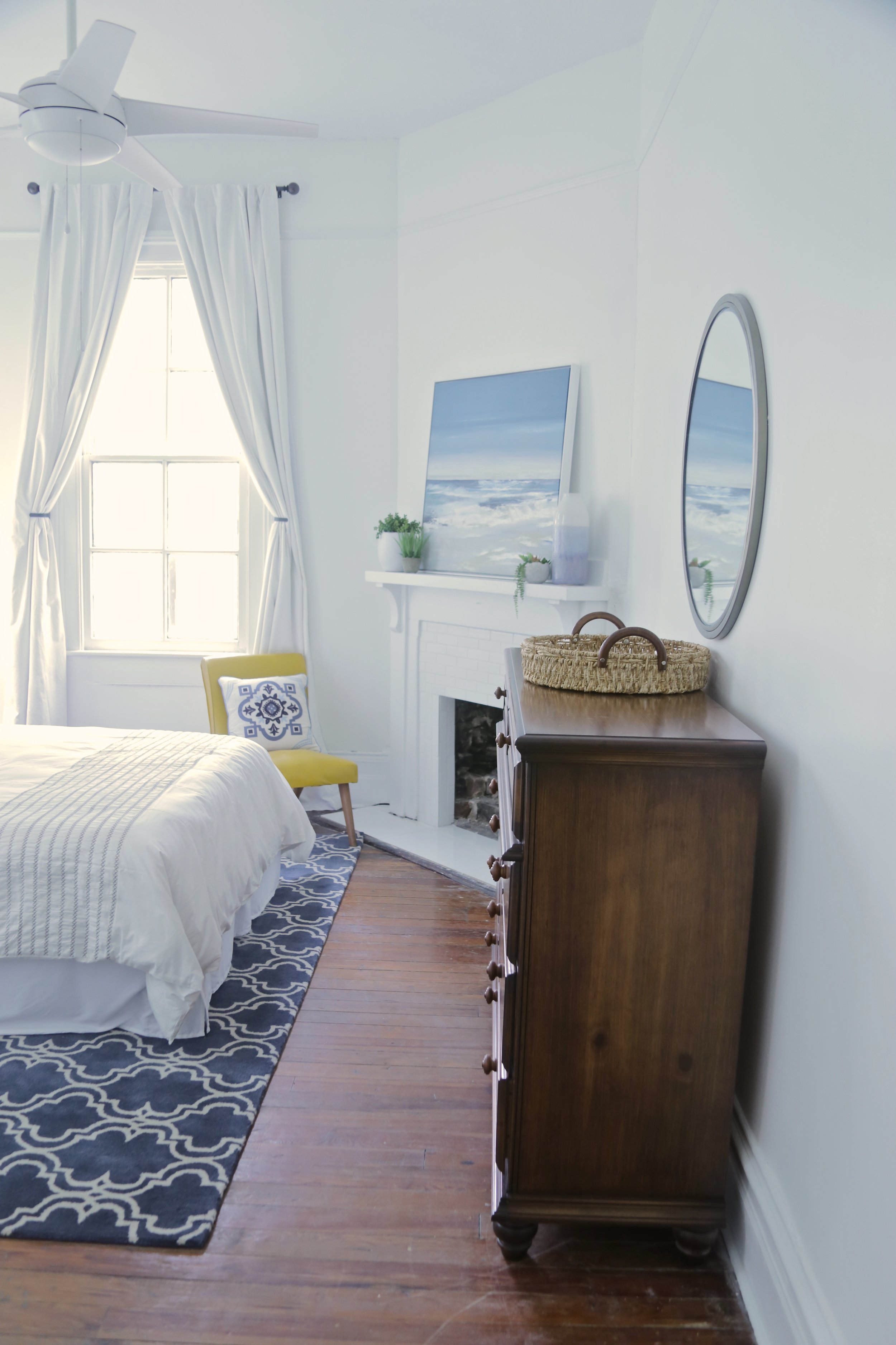
Over the past several months, I was very fortunate to have been given the opportunity to stretch my wings and help design and decorate a victorian home in the heart of Savannah's historical district to become an AirBnB rental property for some good friends. This blog post is the final culmination of lots and lots and LOTS of hard work by many, many people in bringing this home to a beautiful new life. You might want to grab a coffee and get comfy...this one's a long one. :)
THE BACKSTORY AND BEFORE PICTURES
To start, the house itself had amazing bones and the most perfect location in downtown Savannah (just a block away from beautiful Forsyth Park!), but there was definitely much work to be done to get this diamond in the rough where it needed to be. Prior to purchasing, the house had been used as a rental property for college students...and you could definitely tell it had been used by college students. The paint colors, the smells, the cats, the rabbits, the general lack of care or concern...you get the picture. Here are some before pictures of that hopefully give you an idea of where we started:
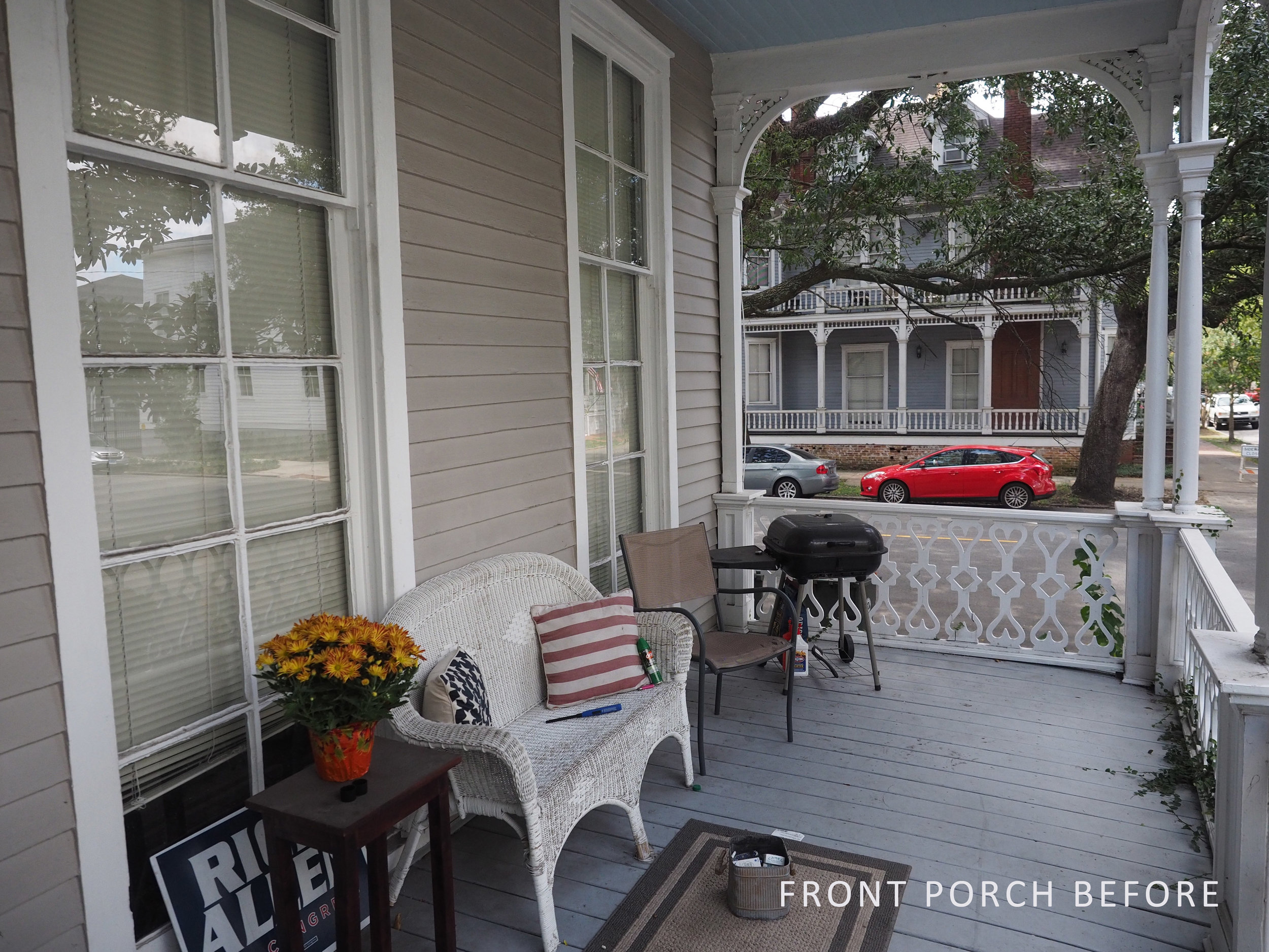
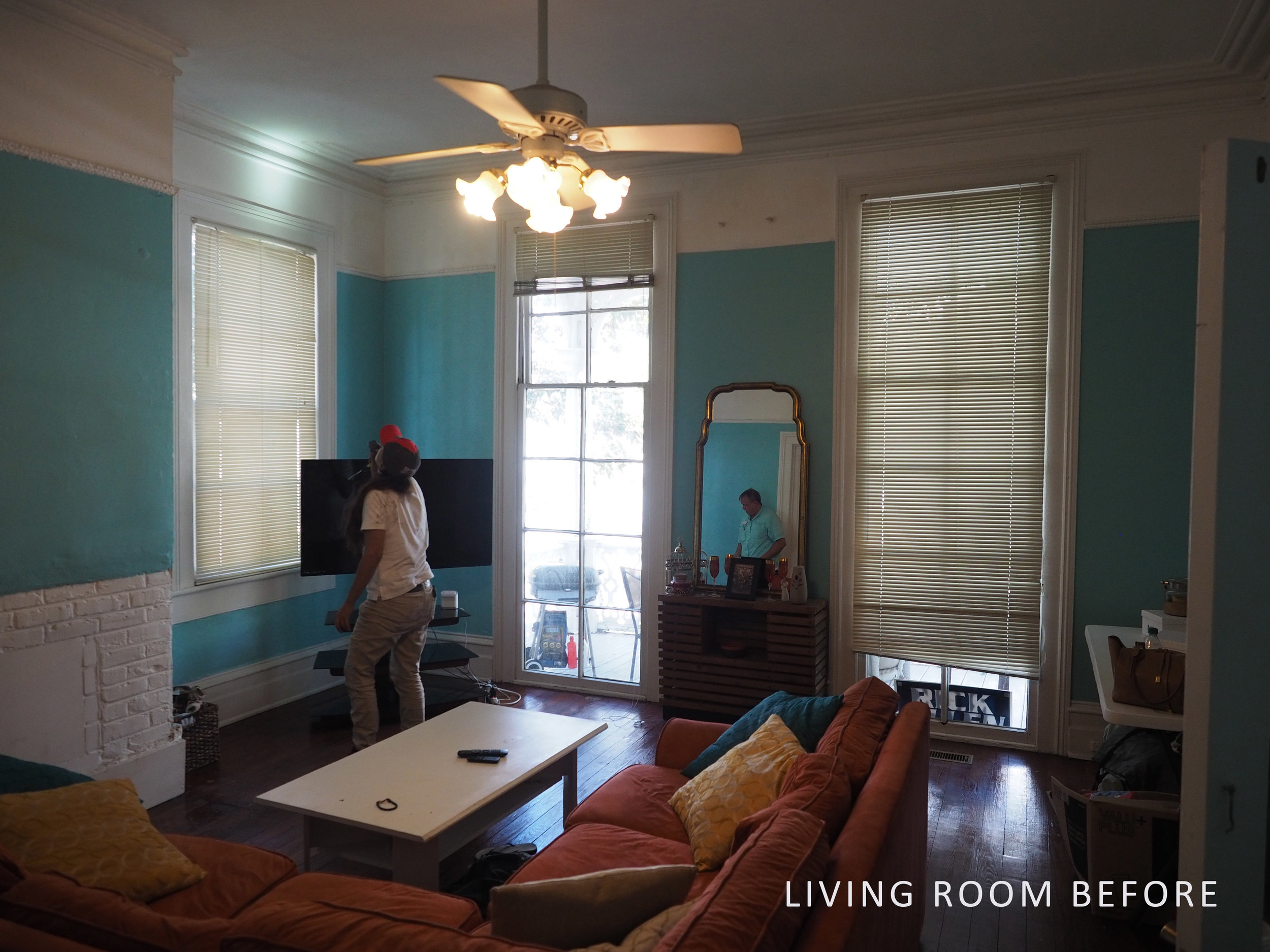
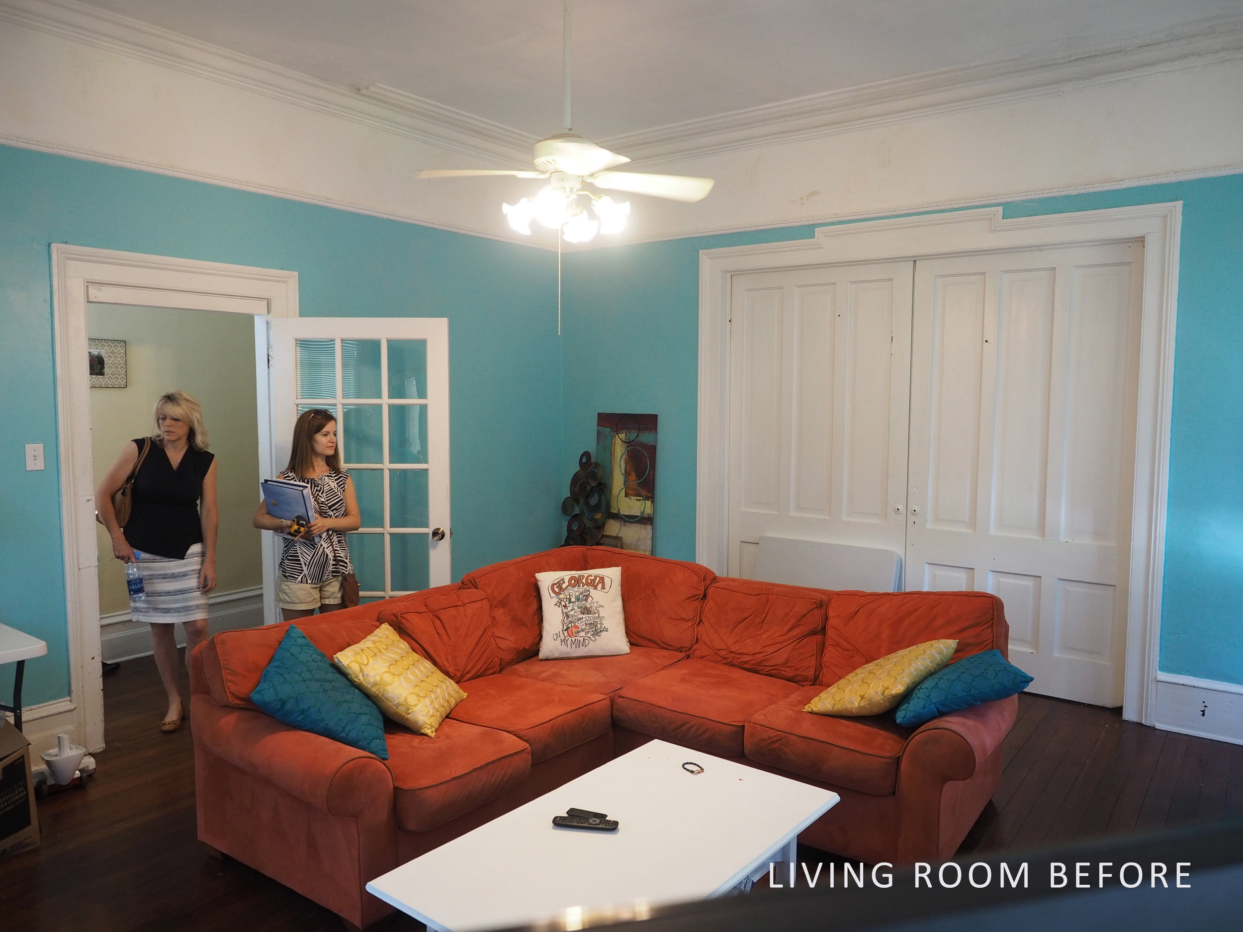

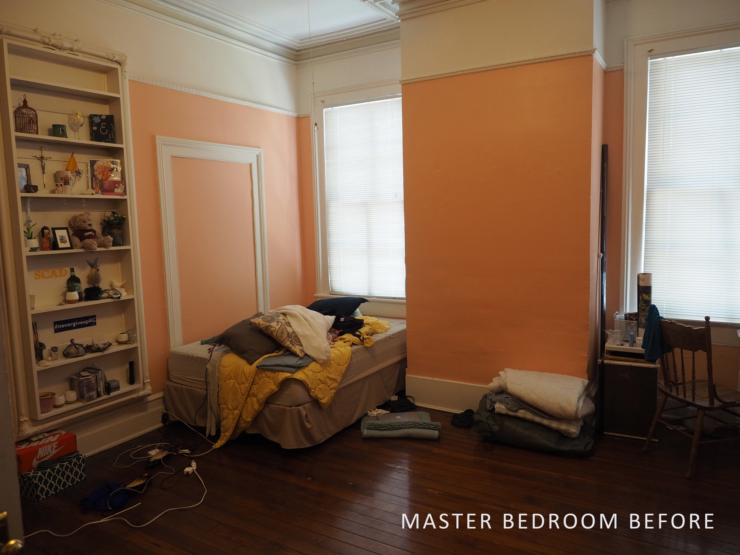
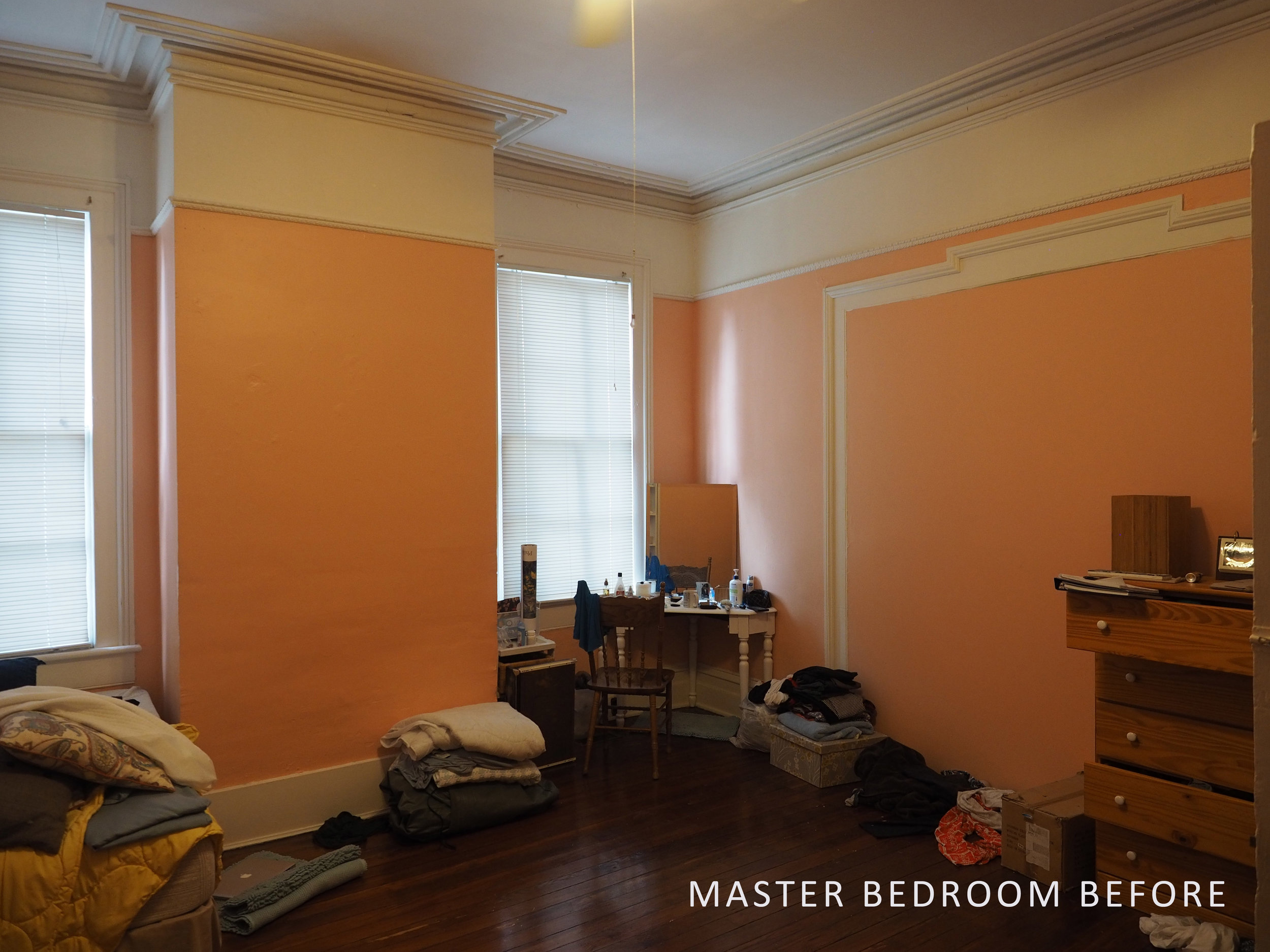
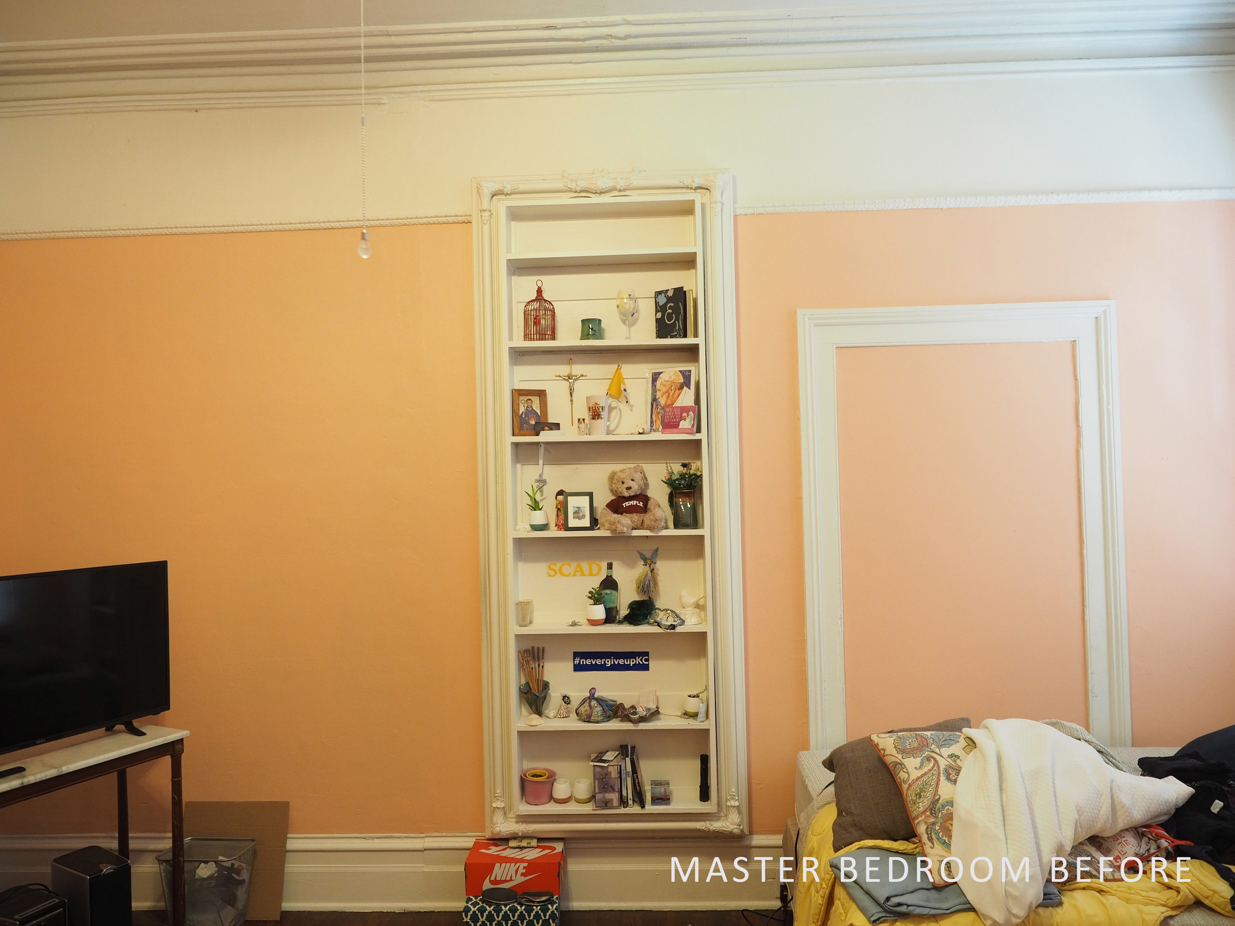


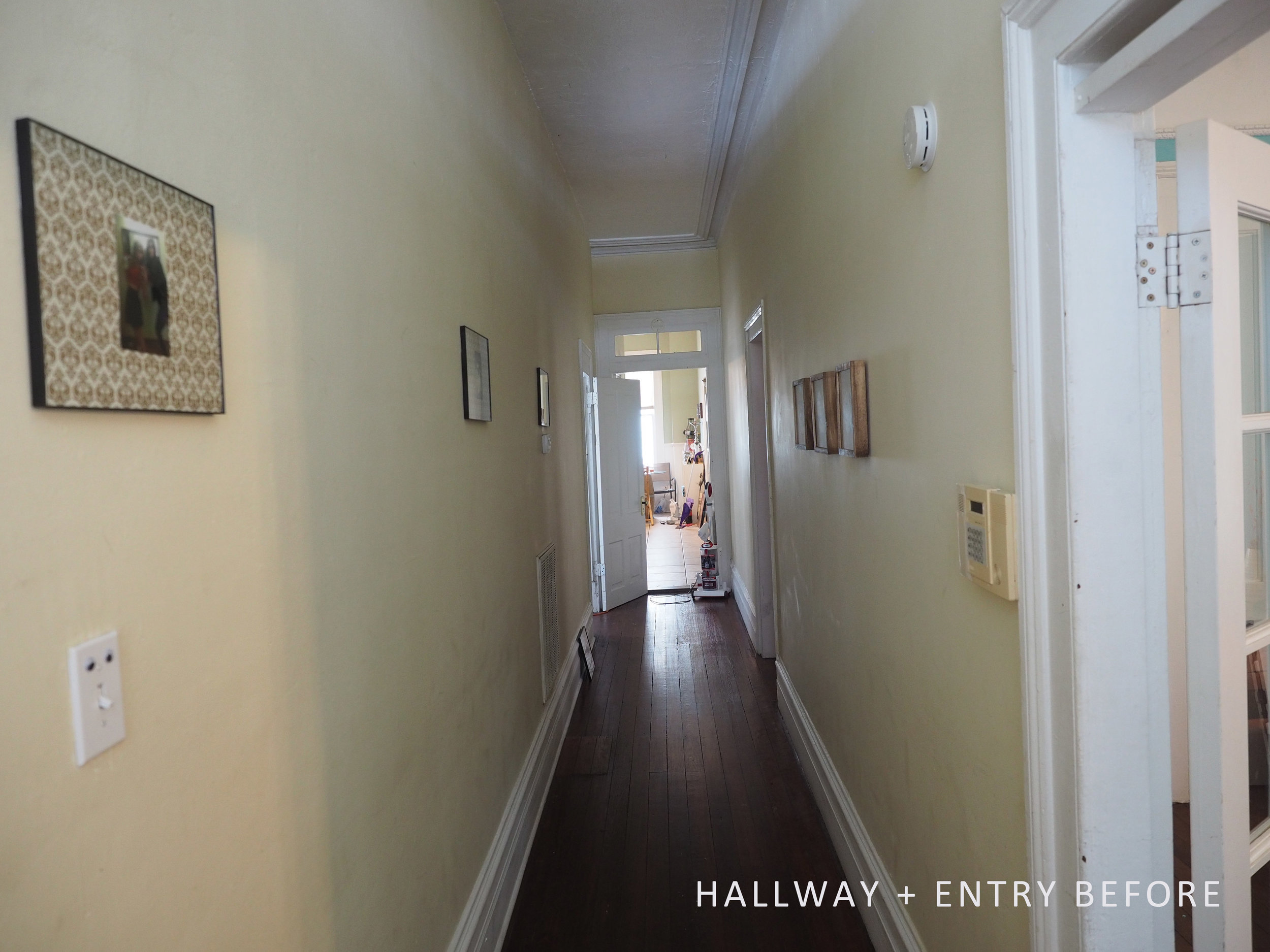

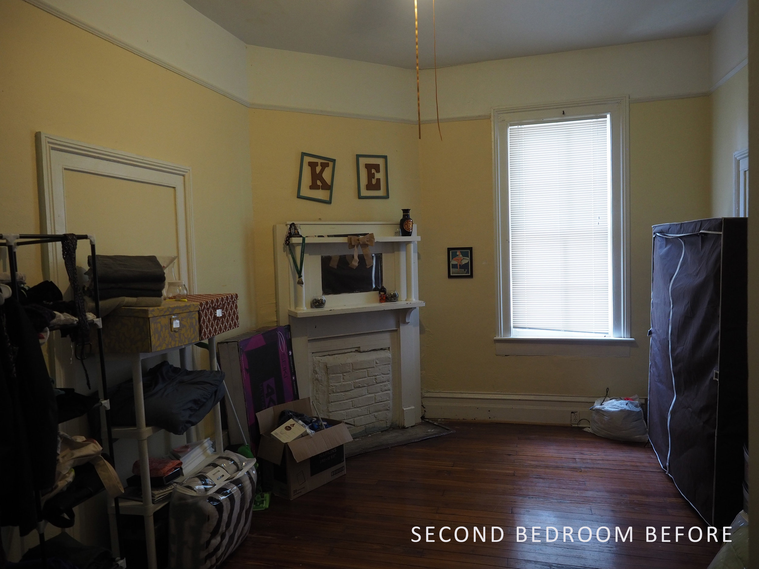
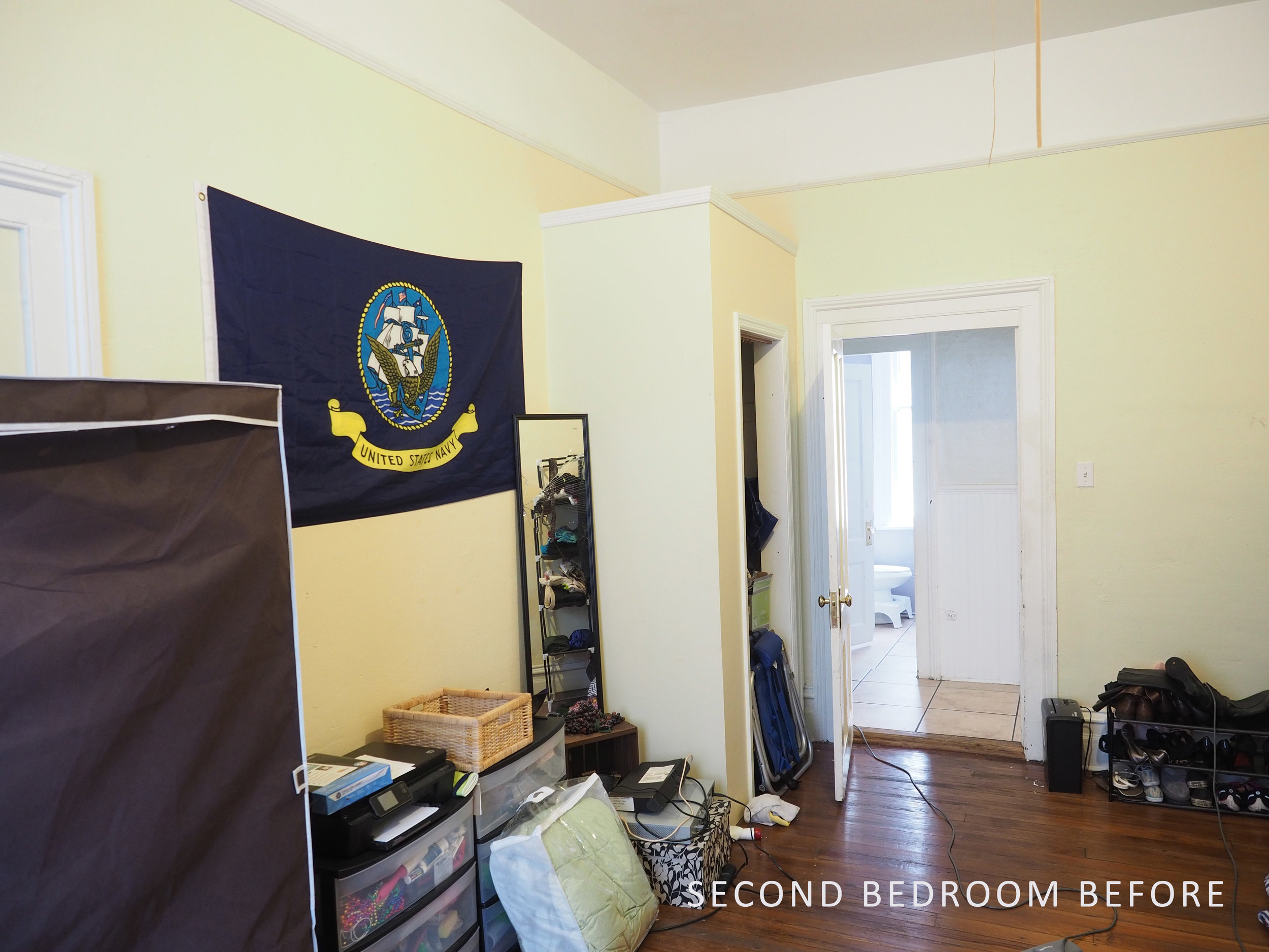
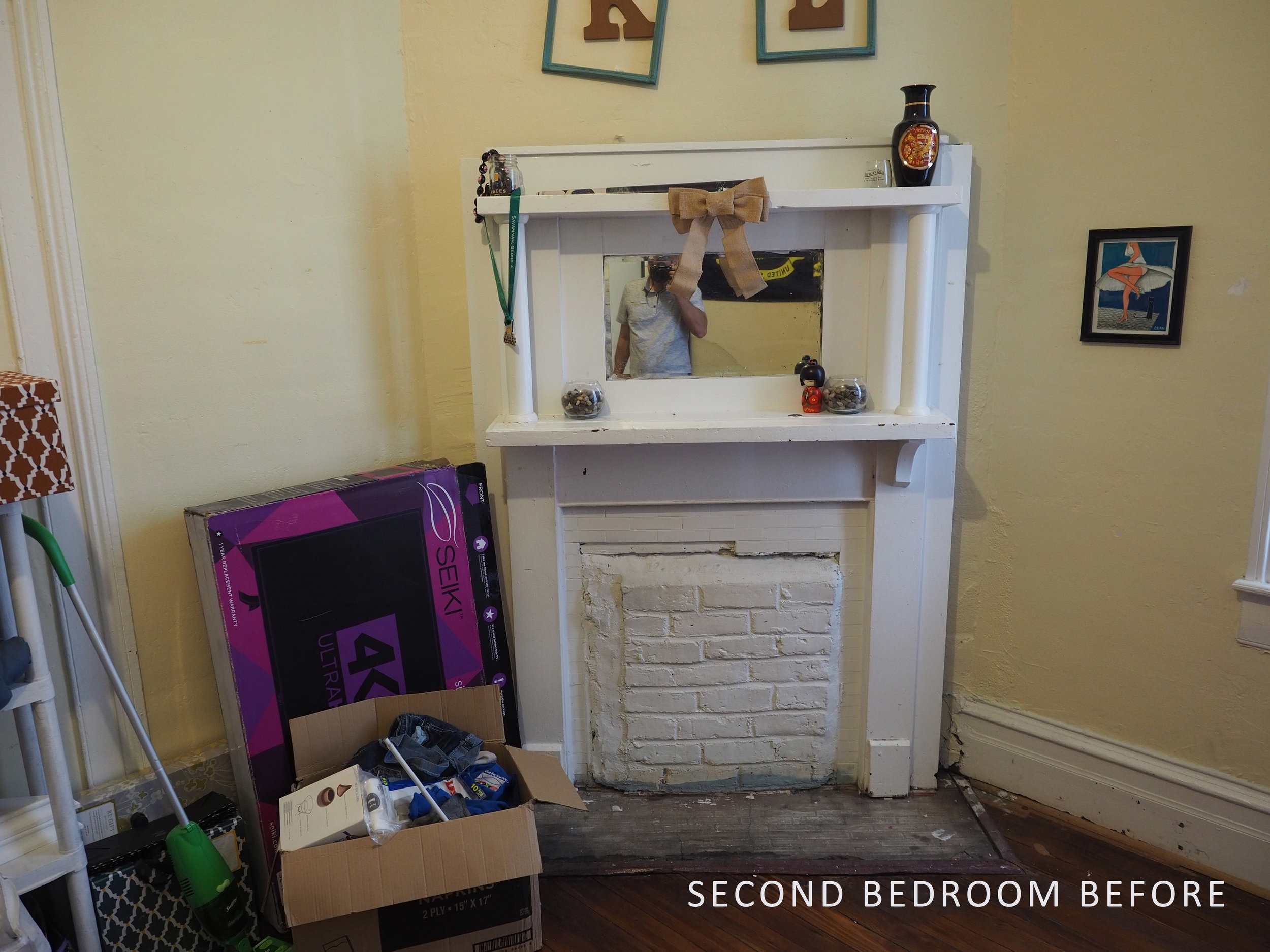

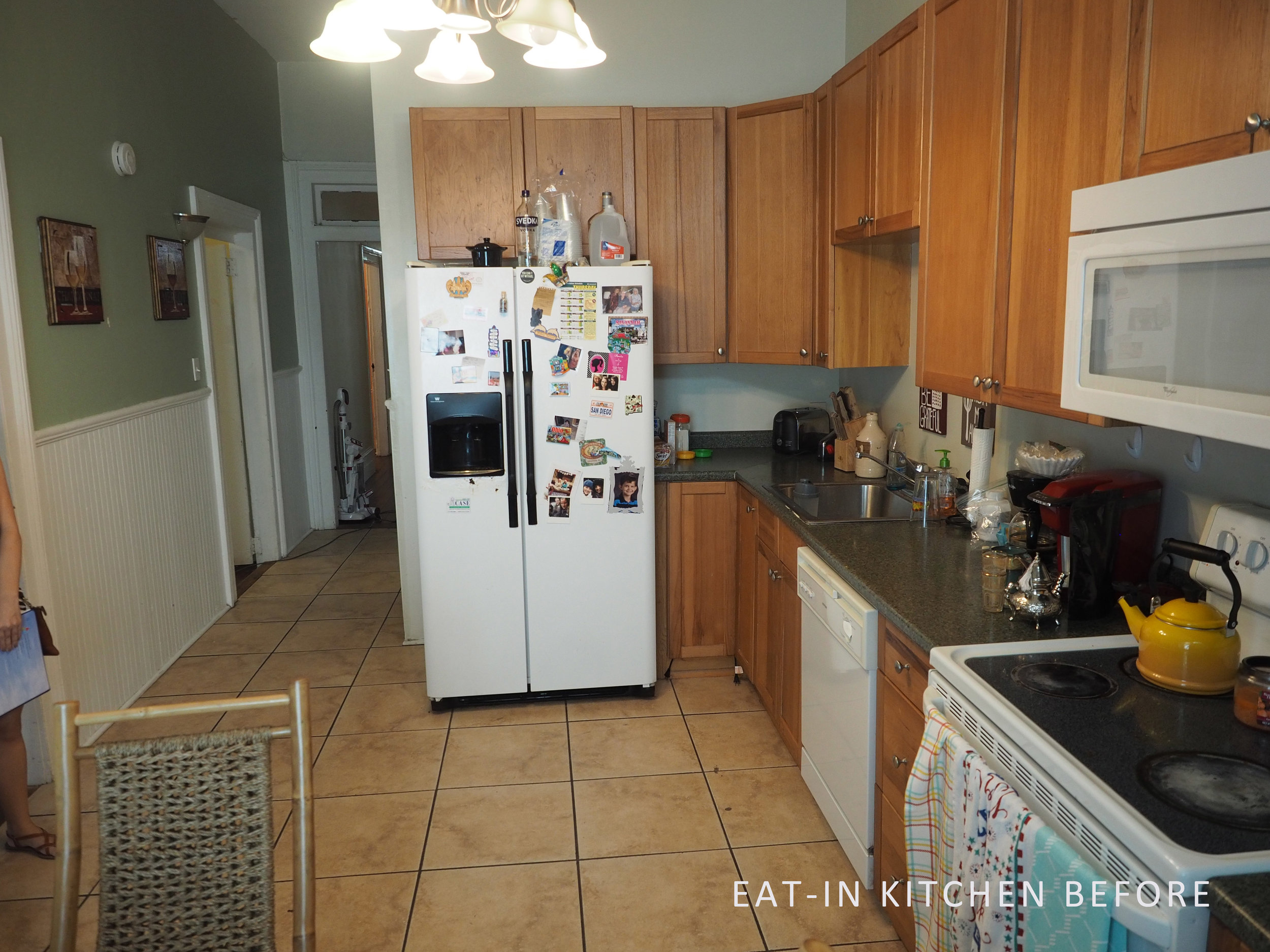
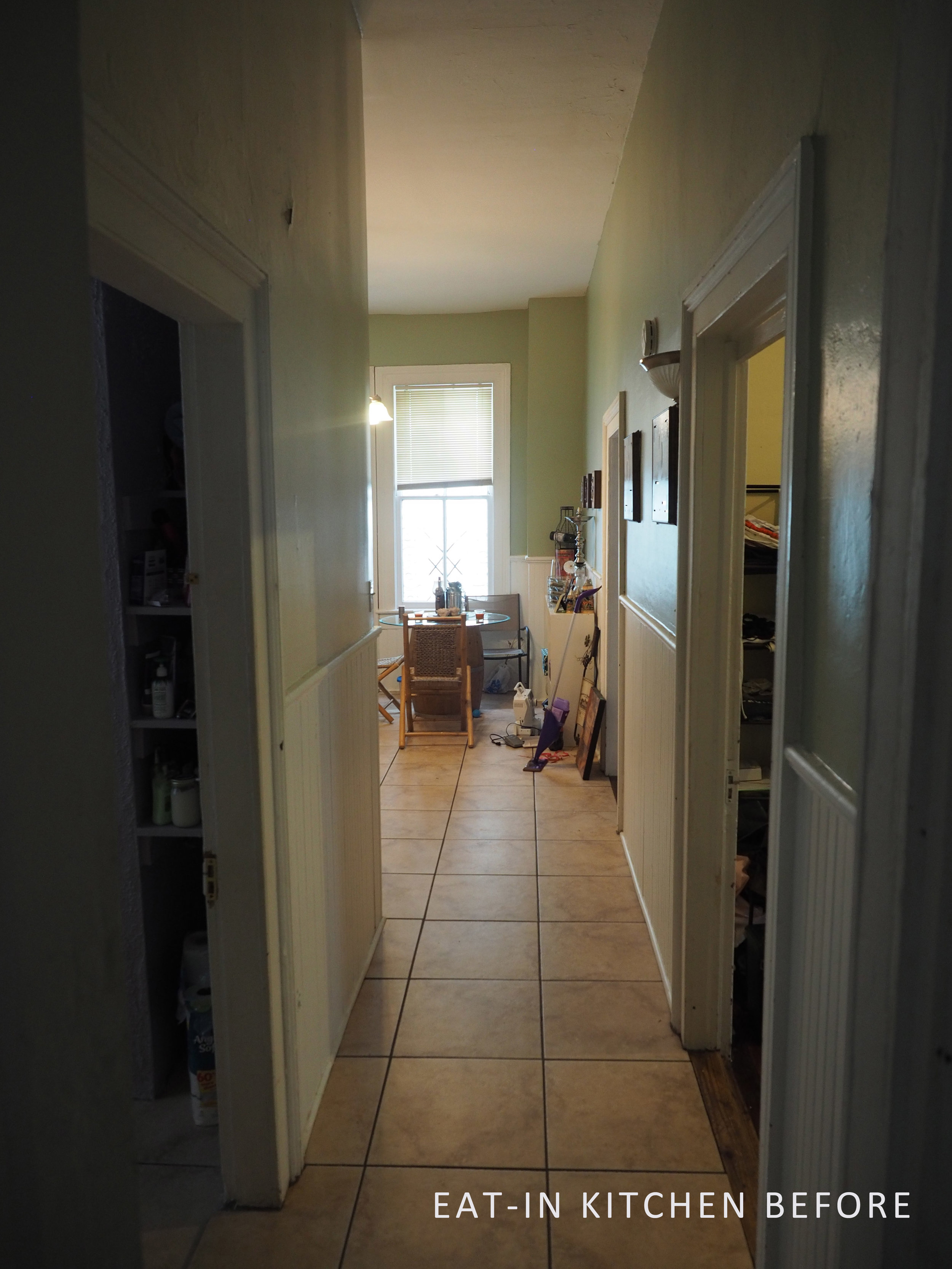
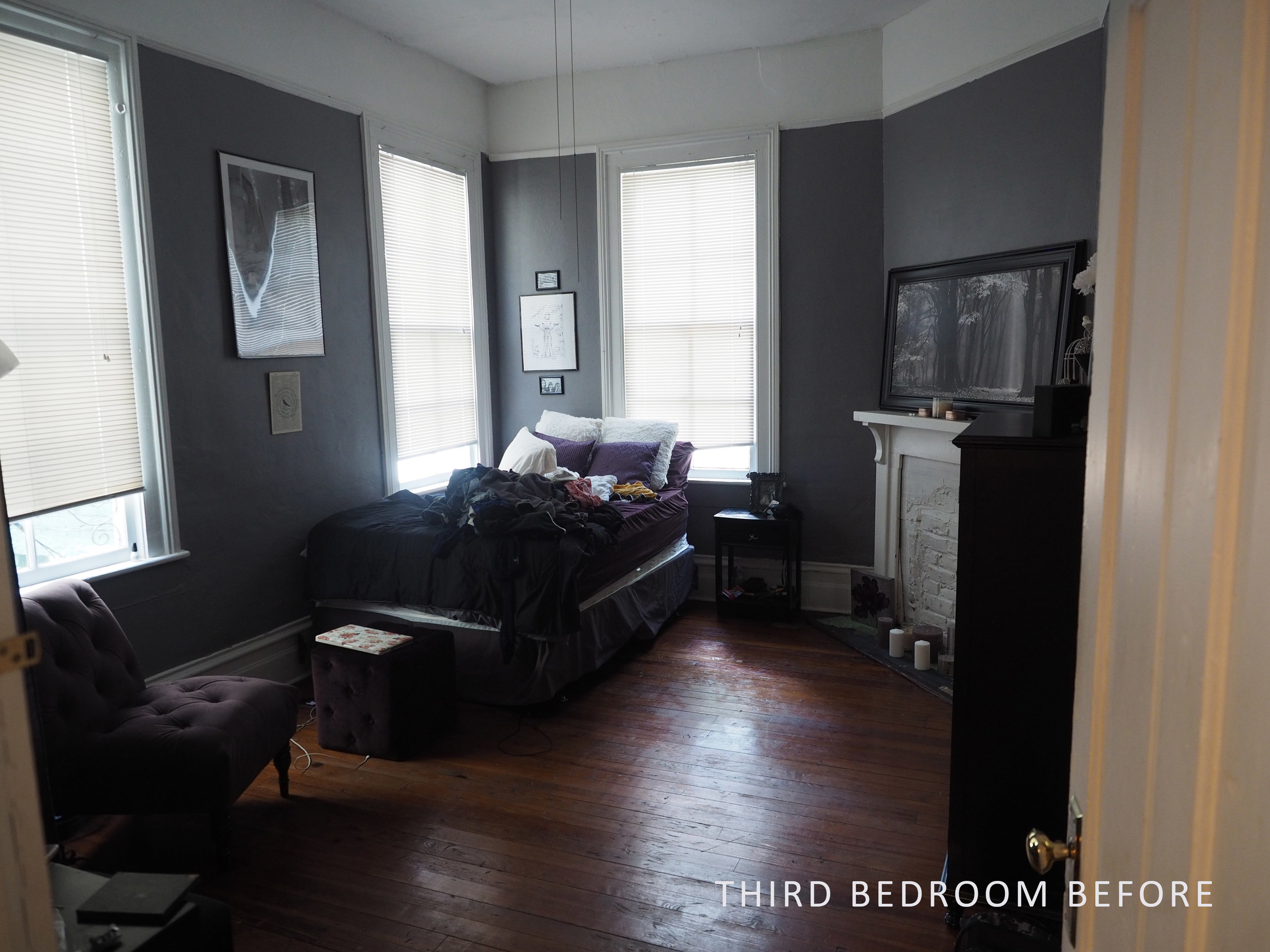

Scary, right? But you can totally see the potential hiding underneath! There were several areas in need of TLC, but we needed to prioritize. There was a pretty tight budget and timeline to take into consideration in figuring out what to tackle first. The whole house obviously needed to be painted, which was a huge job in and of itself, and due to the age of the house, there was lead paint that we needed to be concerned with. The new owners wanted to restore some of the amazing, original features of the home, including the massive pocket doors on the first floor between the living room and master bedroom (which had been drywalled over) and all of the fireplaces (most of which had been bricked in at some point).
Another common feature in these old Victorian homes were doorways leading between all the rooms on the first floor, which we also decided was an important area to address in the restoration of the house. You can see these doorways in several of the before pictures. While the doors themselves had been removed at some point, the door frames had been left and drywalled in leaving awkward, unusable wall areas in all of the bedrooms. We removed the door frames and re-drywalled the walls to give us a clean slate to work in the furnishings.
OVERALL STYLE + INSPIRATION
As far as the overall look and feel for the house, the owners really wanted to embrace a Southern/Savannah coastal vibe, and we had several conversations (and Pinterest boards) to really nail down what that meant for them. Not too modern, but not too literal either. Not a laid-back California coastal, but not a stuffy, traditional coastal with sailboats and starfish everywhere either. My job was to find that perfect balance, and my personal goal was to create a cohesive story from front to back and top to bottom.
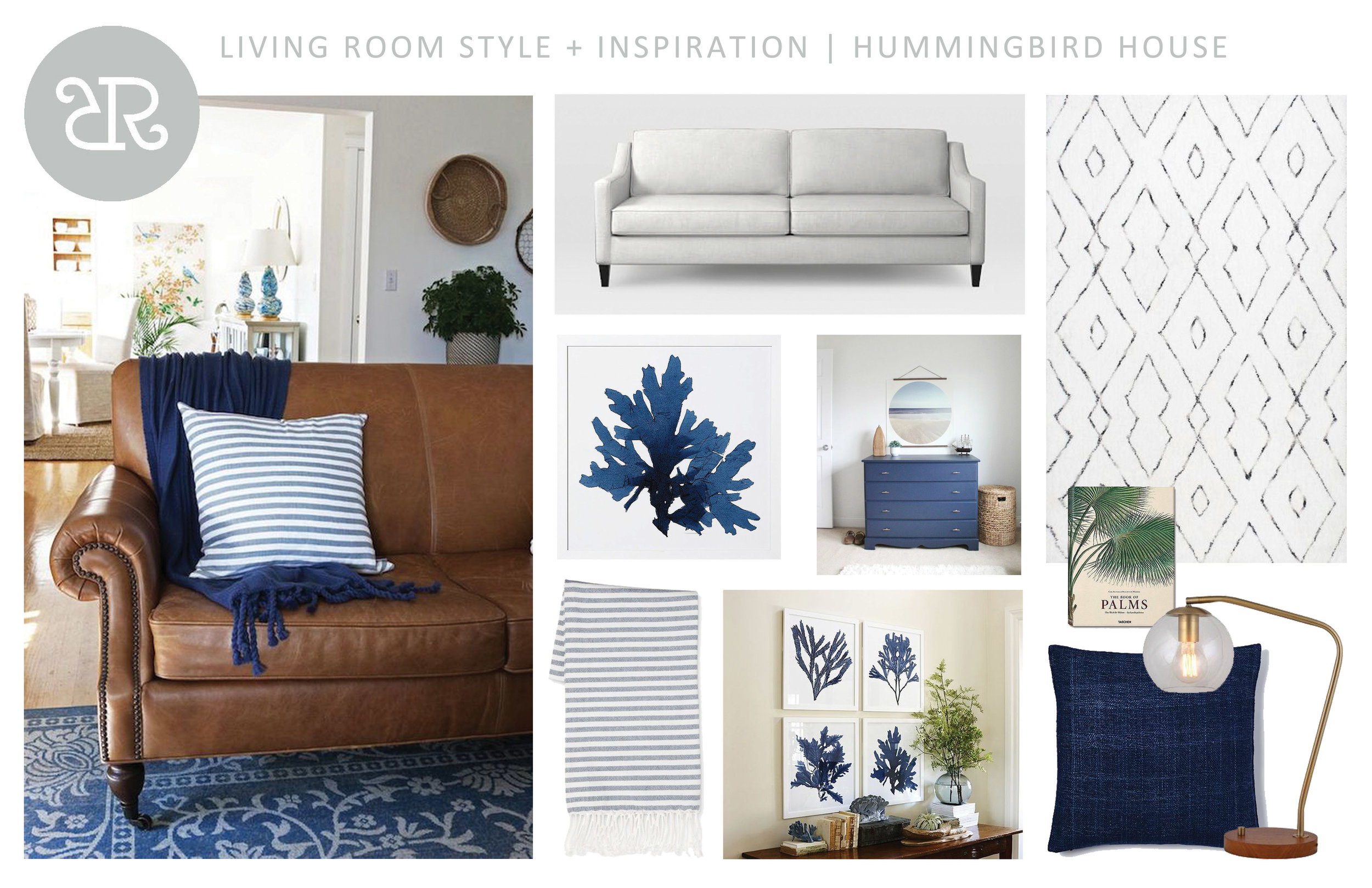
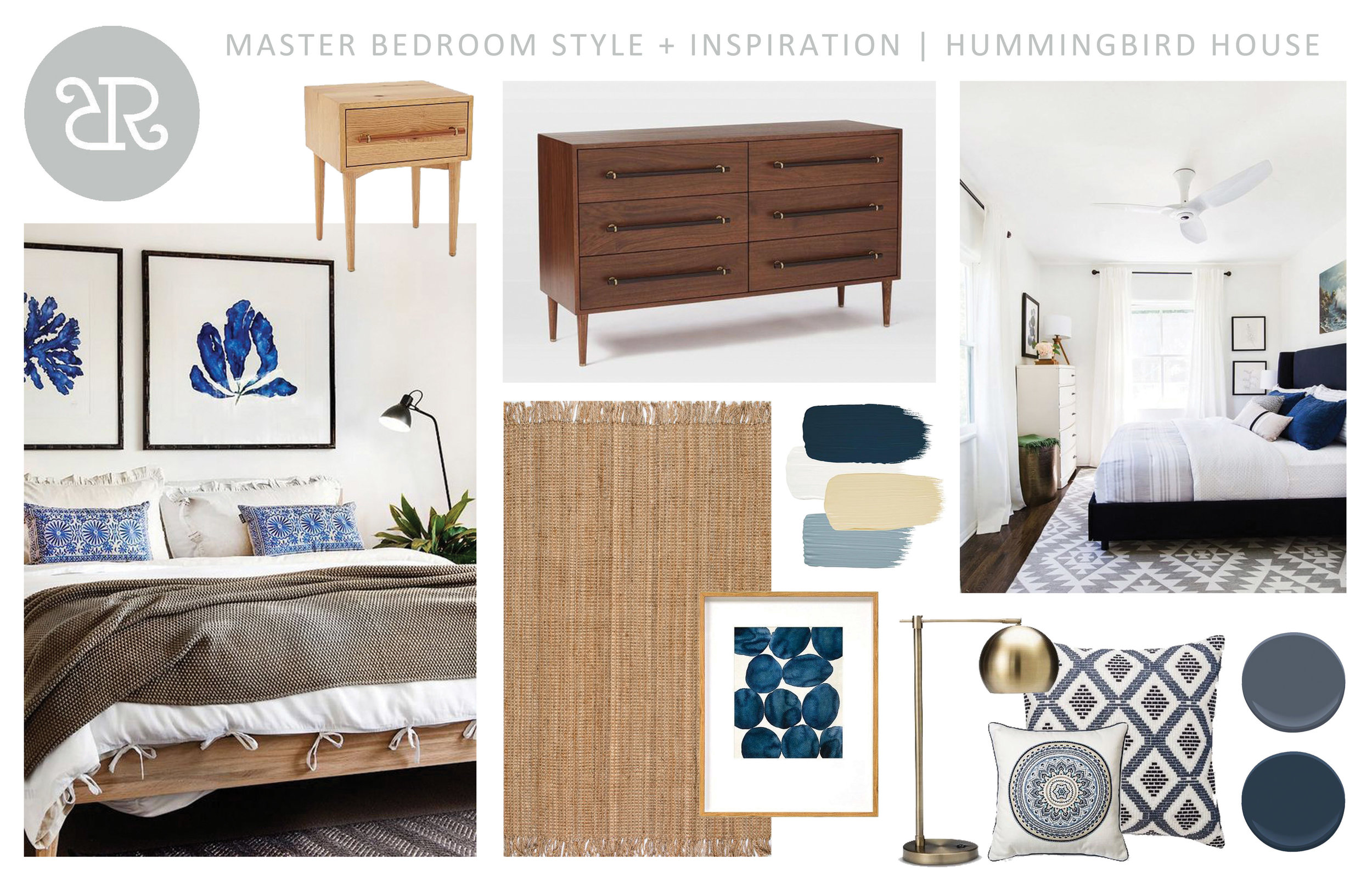
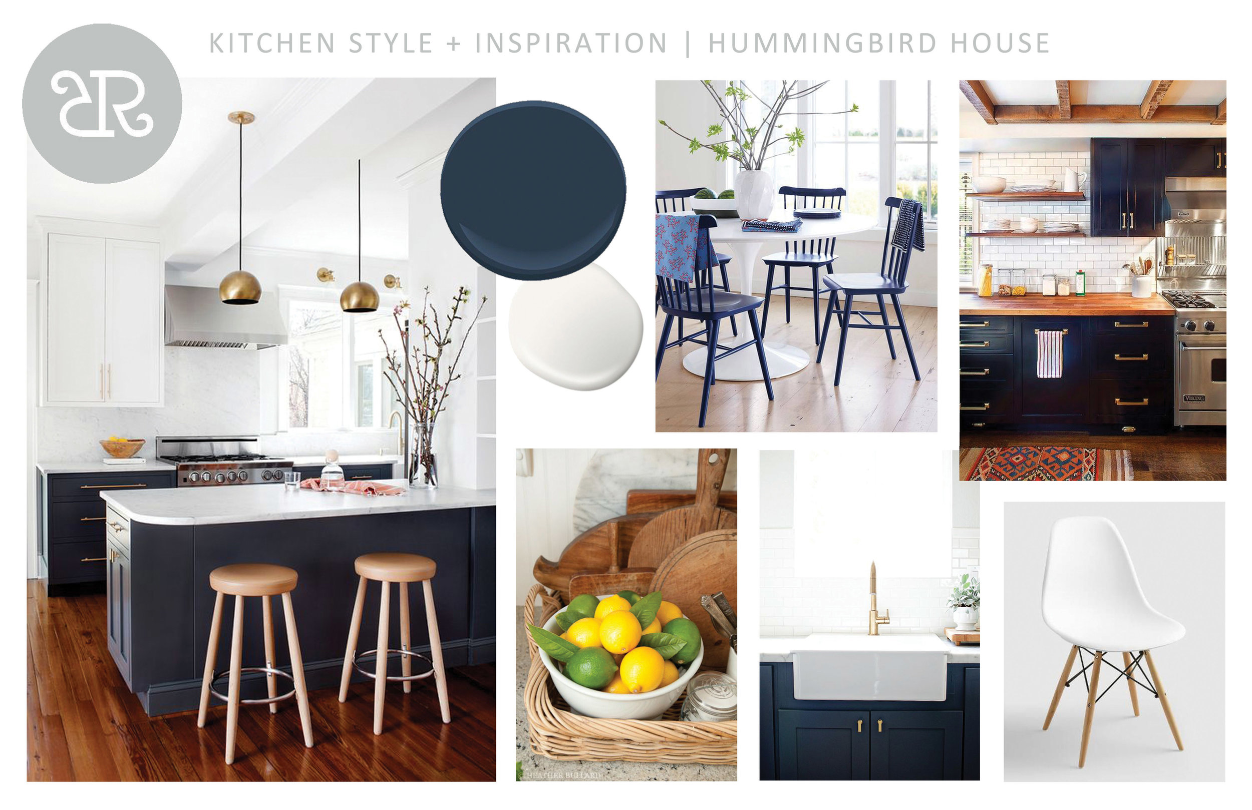
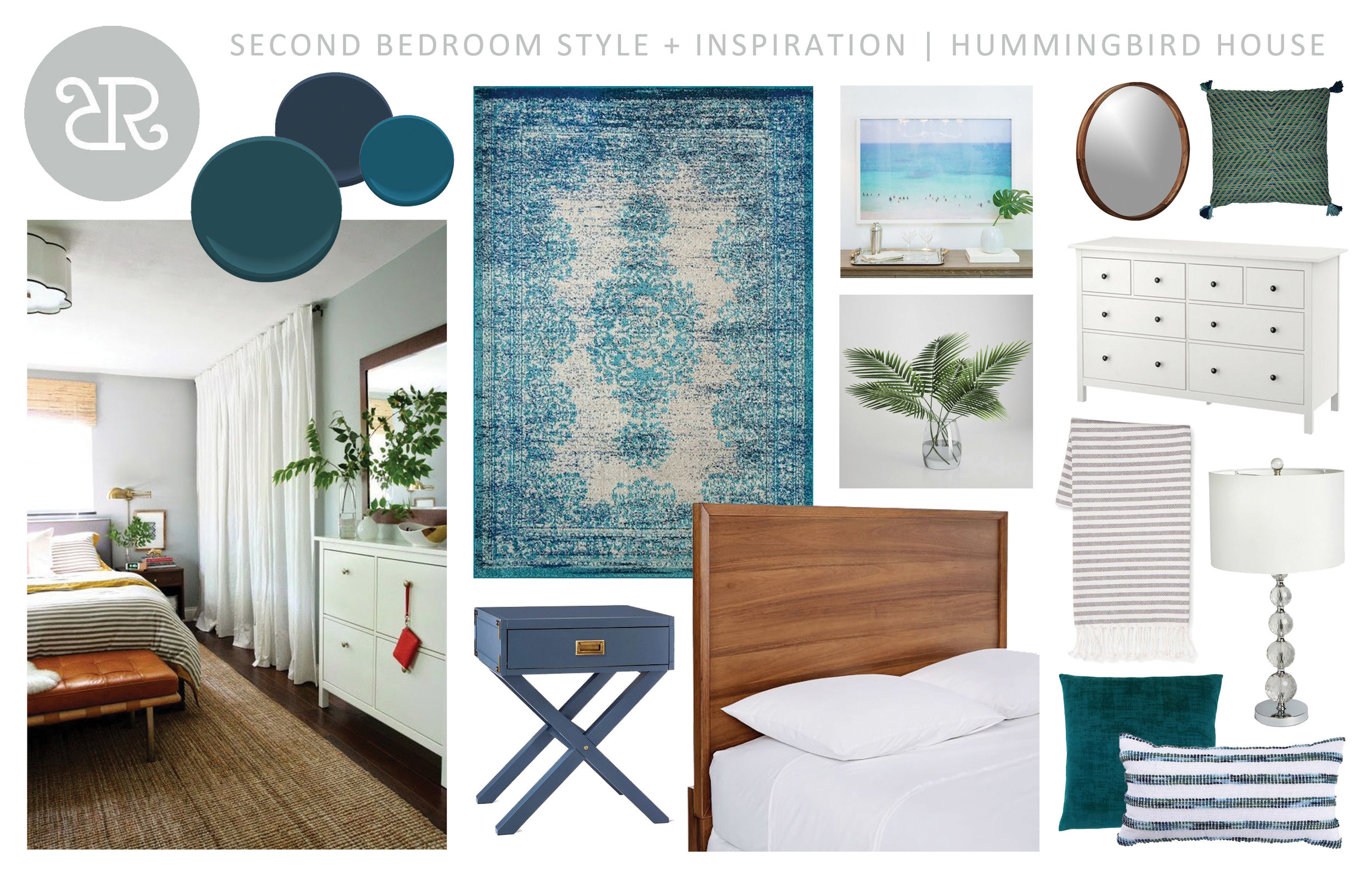
Since this was to become an AirBnB property, we had to be conscious of a lot of our decor choices knowing that there would be a steady rotation of guests in the home and not all of them would treat the property equally. For example, the couch in the living room is a lighter fabric which some people would probably avoid for a rental, but it was an awesome Craigslist find that couldn't be passed up. If it needed to be replaced down the road, it wouldn't be a huge loss. Our goal was to balance quality furnishings that would last and furnishings that the owners wouldn't be heart-broken over if they became damaged by the occasional careless guest.
Also, this house has the most AMAZING light...like so. good. We started with a blank canvas by painting the whole house a combination of Behr's Whisper White and Ultra Pure White to let all that beautiful light shine and bounce around. From there, we used a cool color palette ranging from deep navy blues to vibrant teals in a lot of the furnishings and accessories. I kept things balanced by bringing in warmer accents and textures with leather, brass, wicker, seagrass, jute, and various wood tones. A combination of both faux and fresh greenery helped push that coastal vibe the owners were looking for, as well. (As a tip, faux foliage can be great for a rental property since you don't have to worry about replacing it every week!) We brought in some traditional coastal accessories such as coral and woven baskets but kept things modern with sleek lighting, bright pillows in a variety of textures and patterns, and the occasional mid-century or Scandinavian inspired piece.
THE FRONT PORCH
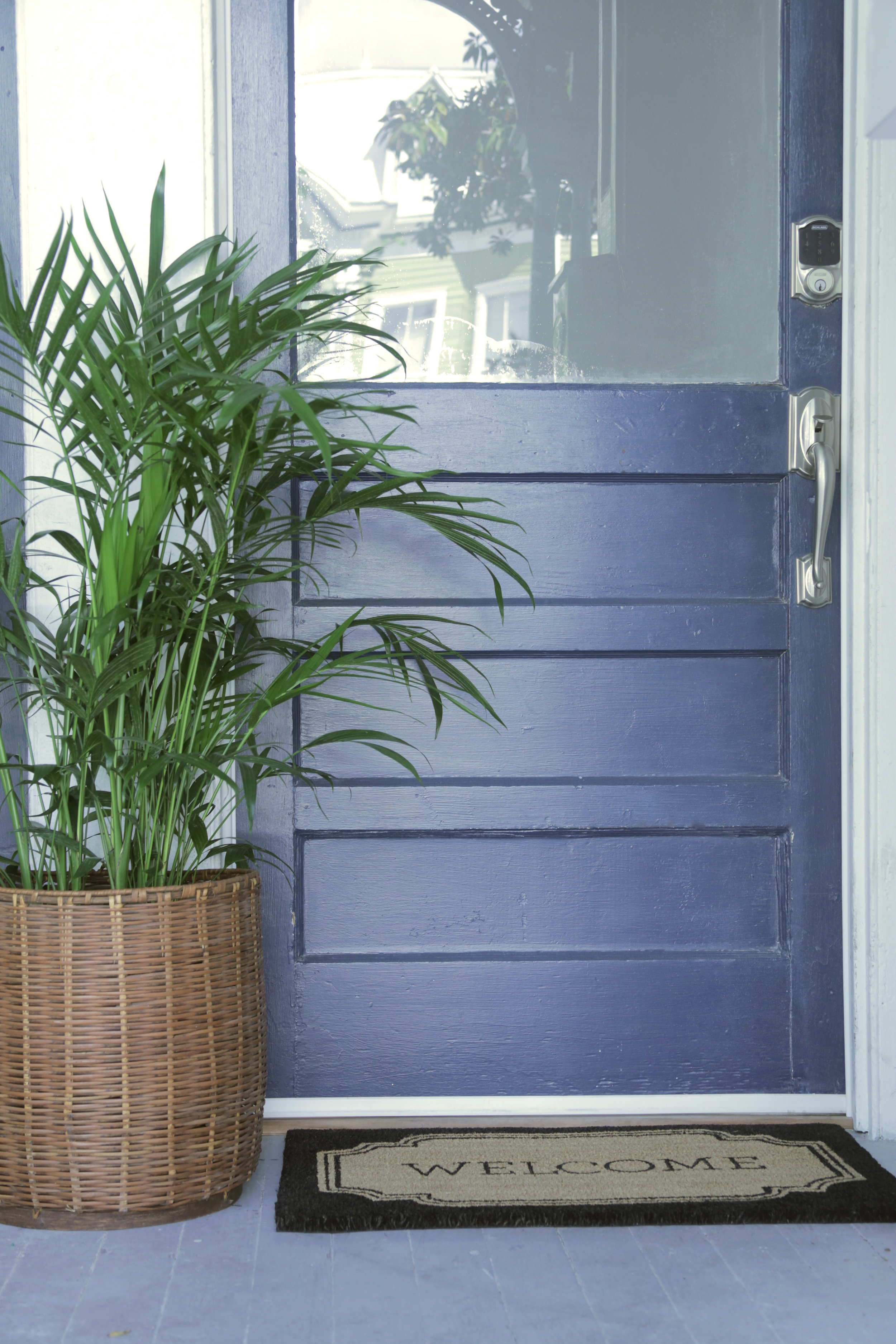
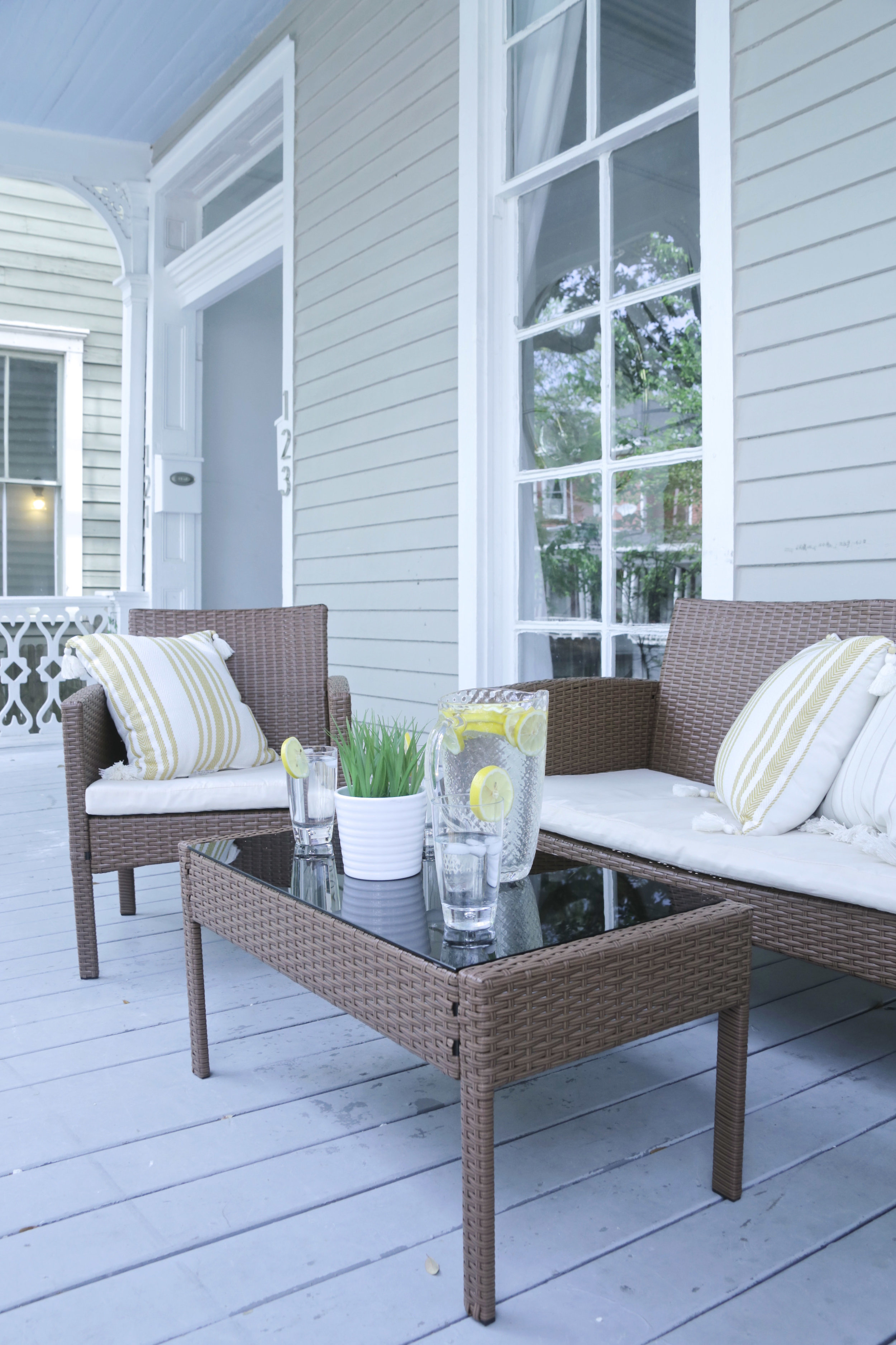
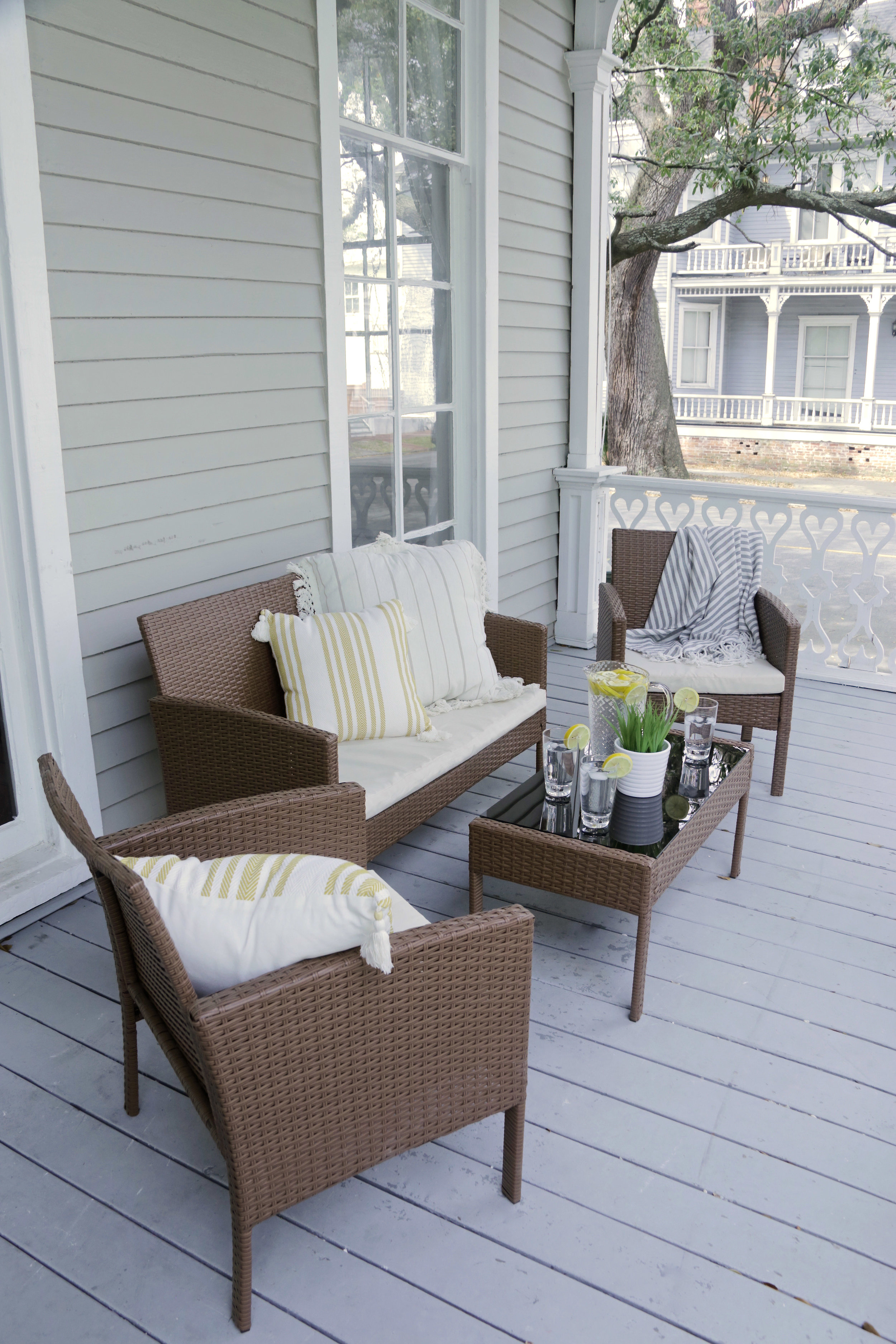
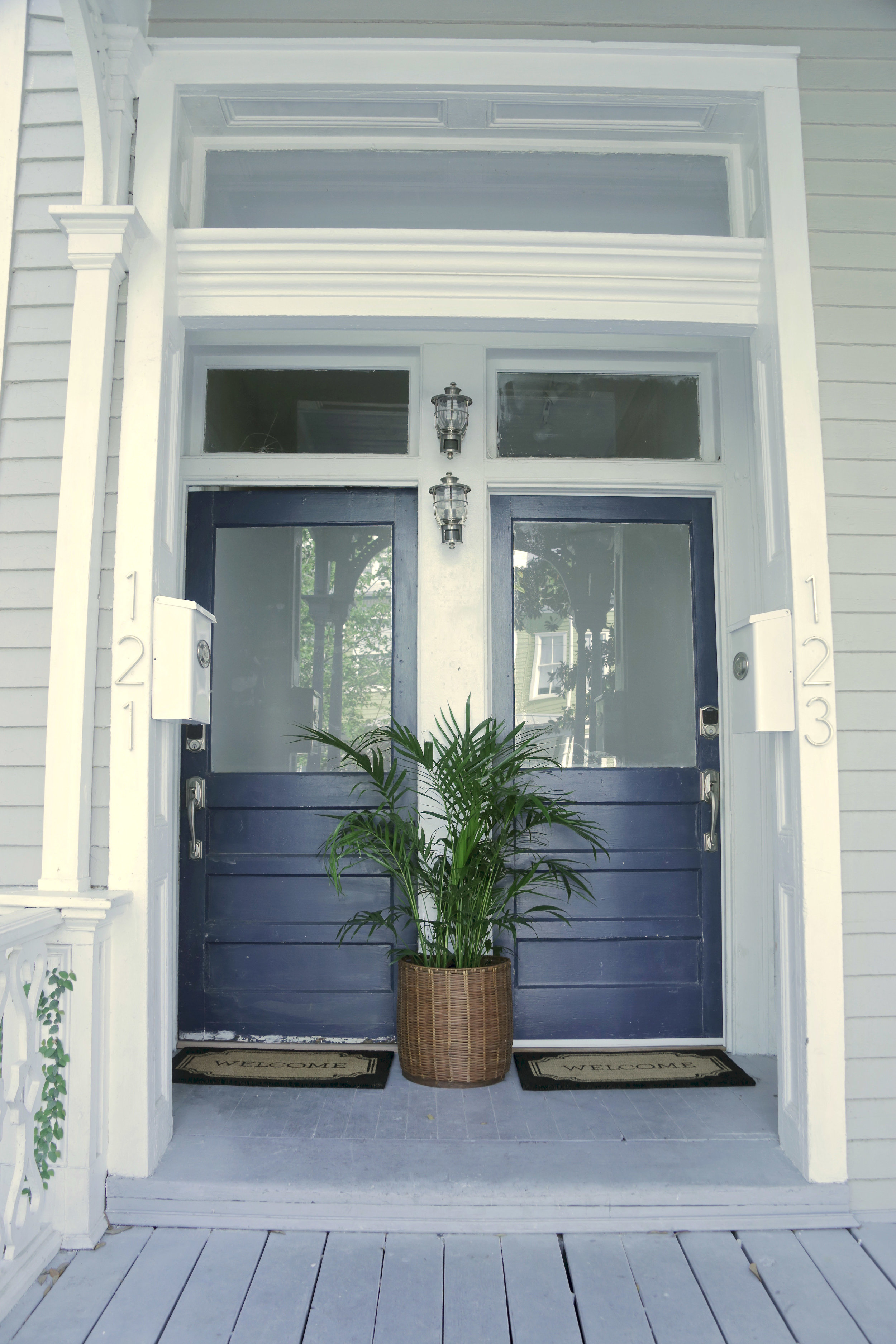
First impressions matter, and we wanted to make sure that guests were being greeted by a lovely space before they even entered the home. The front doors of the house were already painted the perfect shade of blue, so we kept them as is. New lighting, privacy window film, door hardware, mailboxes, door numbers, welcome mats, and playful palm spruced up the entry. A simple outdoor furniture set was purchased for guests to enjoy the large front porch that these beautiful, old southern homes are so well known for in Savannah.
THE LIVING ROOM
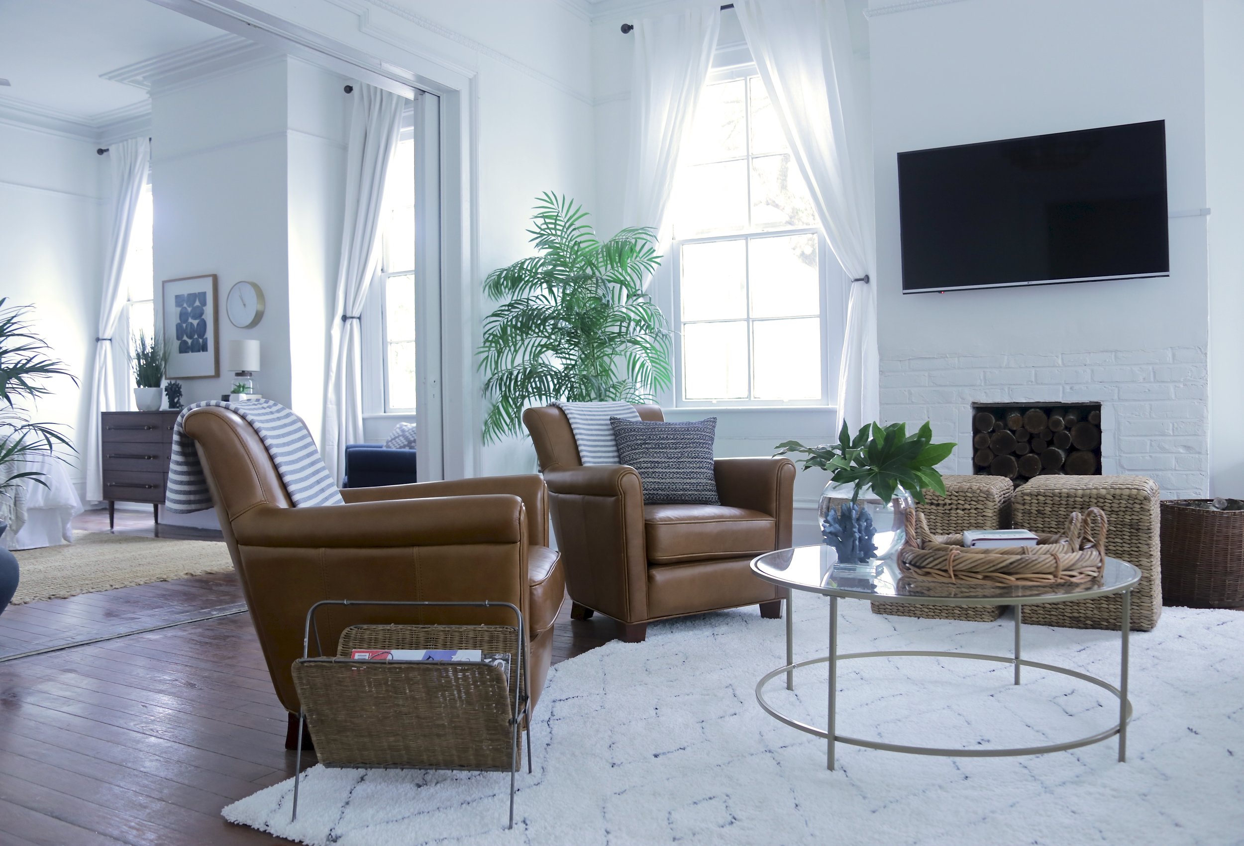
See what I mean about the light in this house?? #somanyhearteyes The floor-to-ceiling paned windows in the living room are one of my favorite architectural details of the home. To highlight the windows in the living room, we did long unlined curtain panels with pull backs for a slightly more traditional and romantic feel.
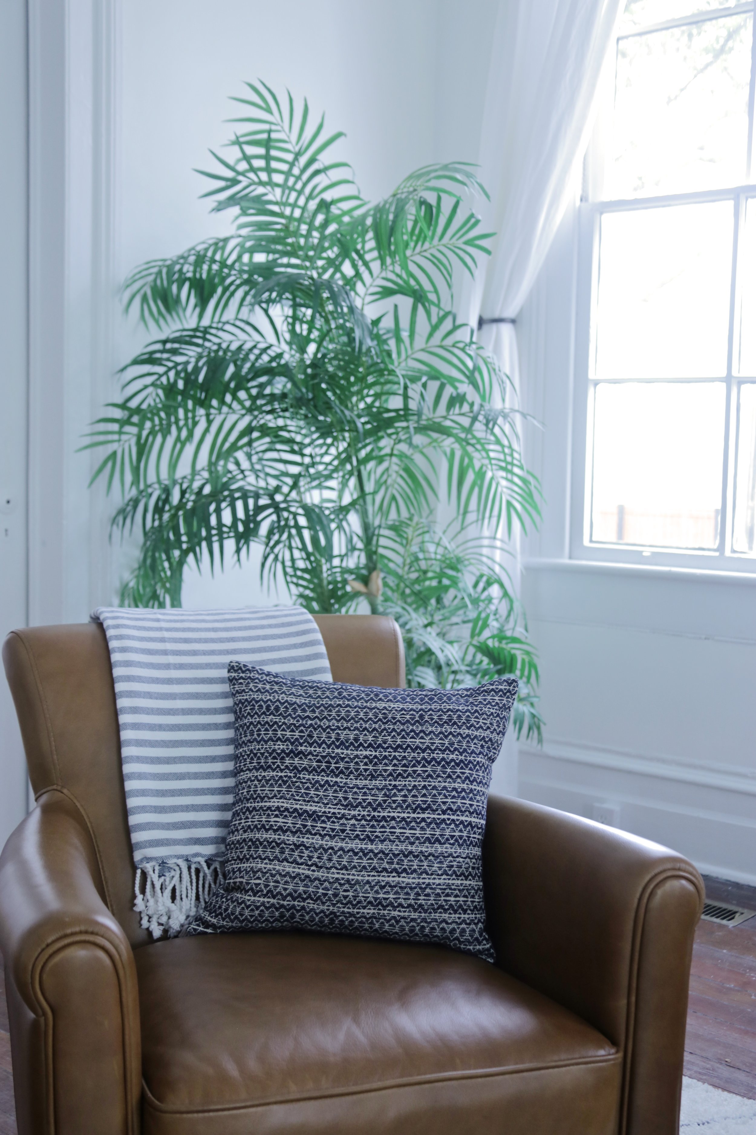
We kept the furnishings for this space sophisticated yet comfortable. The deep leather chairs are great for kicking back after a long day of exploring the city, and the woven seagrass cubes (a local antiques shop score) could be moved around to use as side tables or extra seating. The tufted rug kept the space bright and cozy. Overall, I kept the styling in this room light yet still layered enough to give depth with stacks of thrifted books, sculptural coral, lots of greenery, nautical striped throws, and textured pillows.
We had a hard time finding a light fixture for this space that we all agreed upon. The owners actually found the capiz chandelier, and it ended up being such a great choice for this room. Light and airy, yet perfectly fills the space. We all ended up loving it!
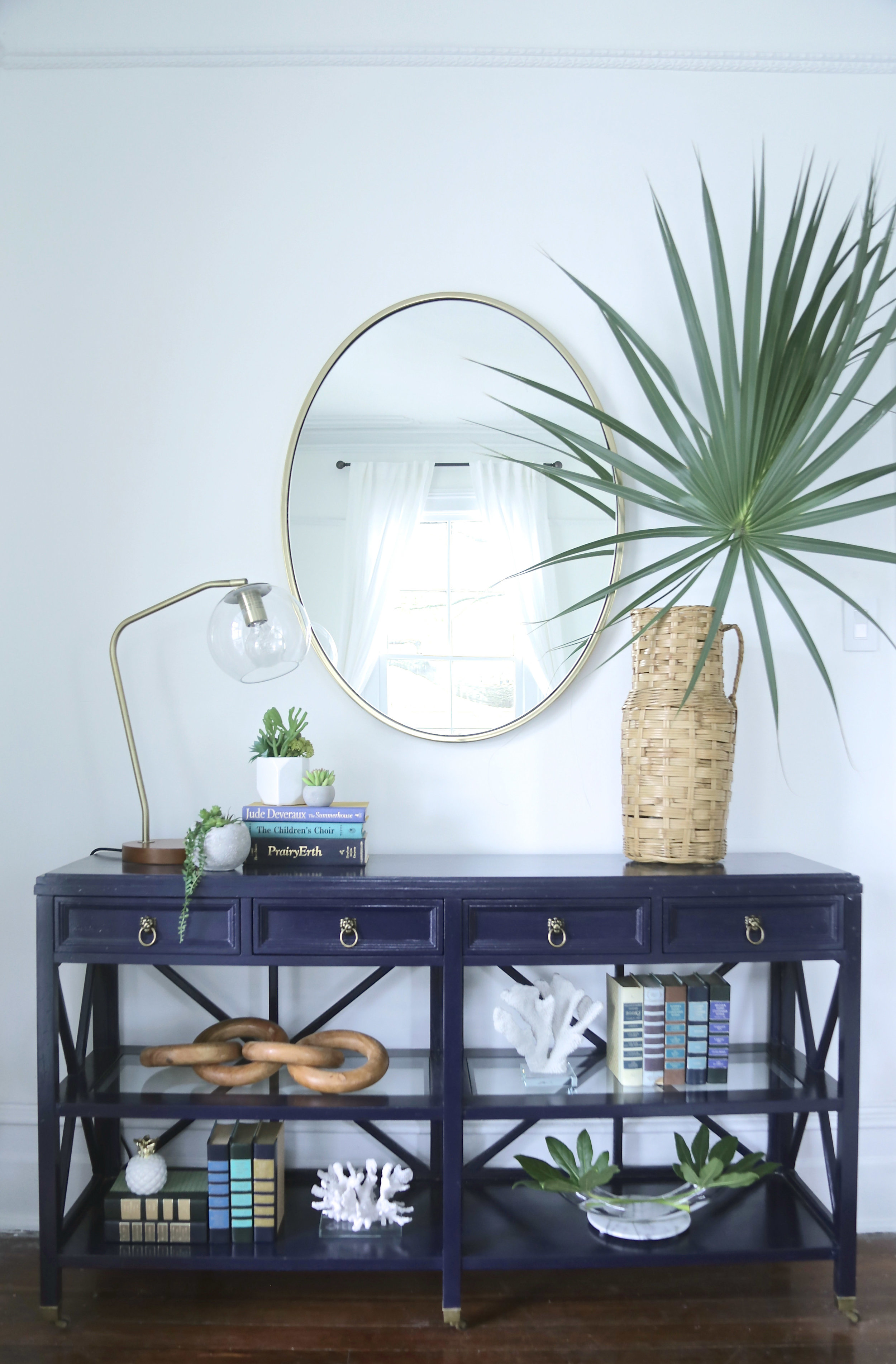
That navy blue sideboard was purchased from a local antiques dealer and is one of my favorite furniture finds for the house. I practically had to fight off two other people to get it! I feel like this piece perfectly embodies that balance of styles that the owners were really after, and it is such a lovely shade of blue.
THE MASTER BEDROOM
Leaving the living room and heading into the master bedroom, you pass through what is my next favorite architectural detail of the house...those ahhh-mazing pocket doors! We all knew this was a detail of the house that absolutely needed to be restored. If you noticed in the "before" pictures, they had been drywalled over on the bedroom side, but thankfully, the doors themselves still functioned and were actually in really great condition. It was just a matter of removing the drywall, doing a little repair work, and giving them a fresh coat of paint. The end result is just SO beautiful, and I am so glad we were able to restore this piece of the home.
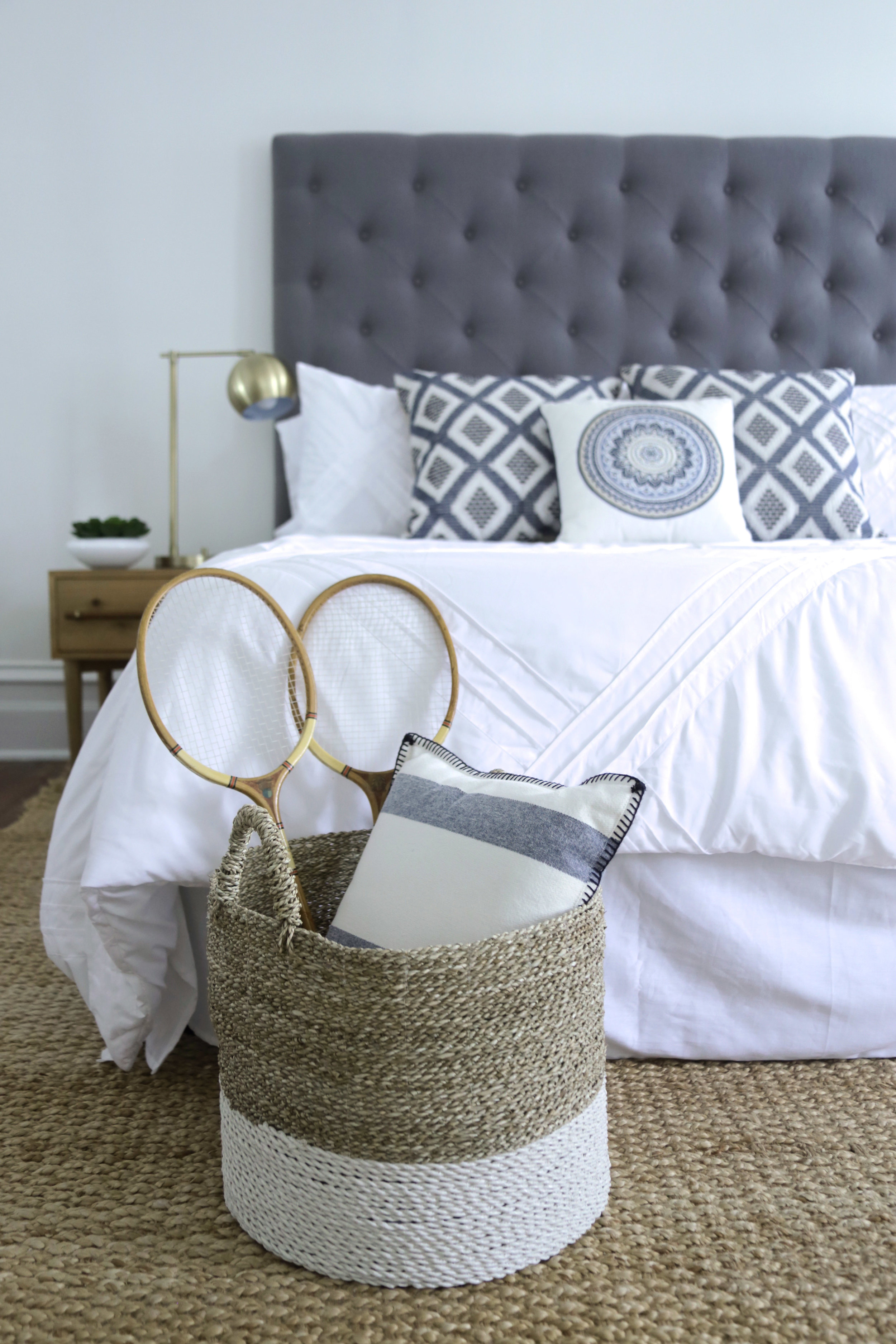
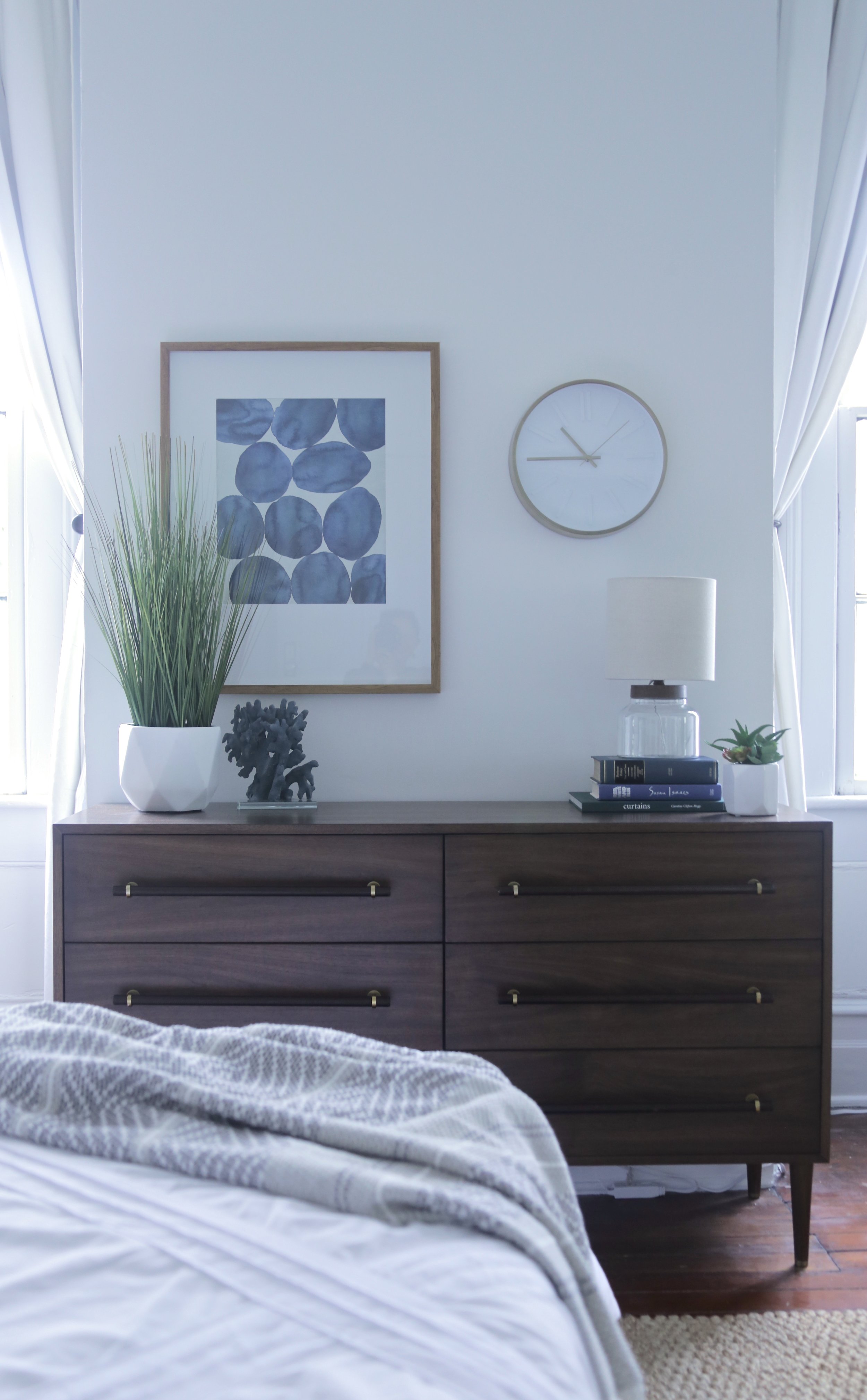
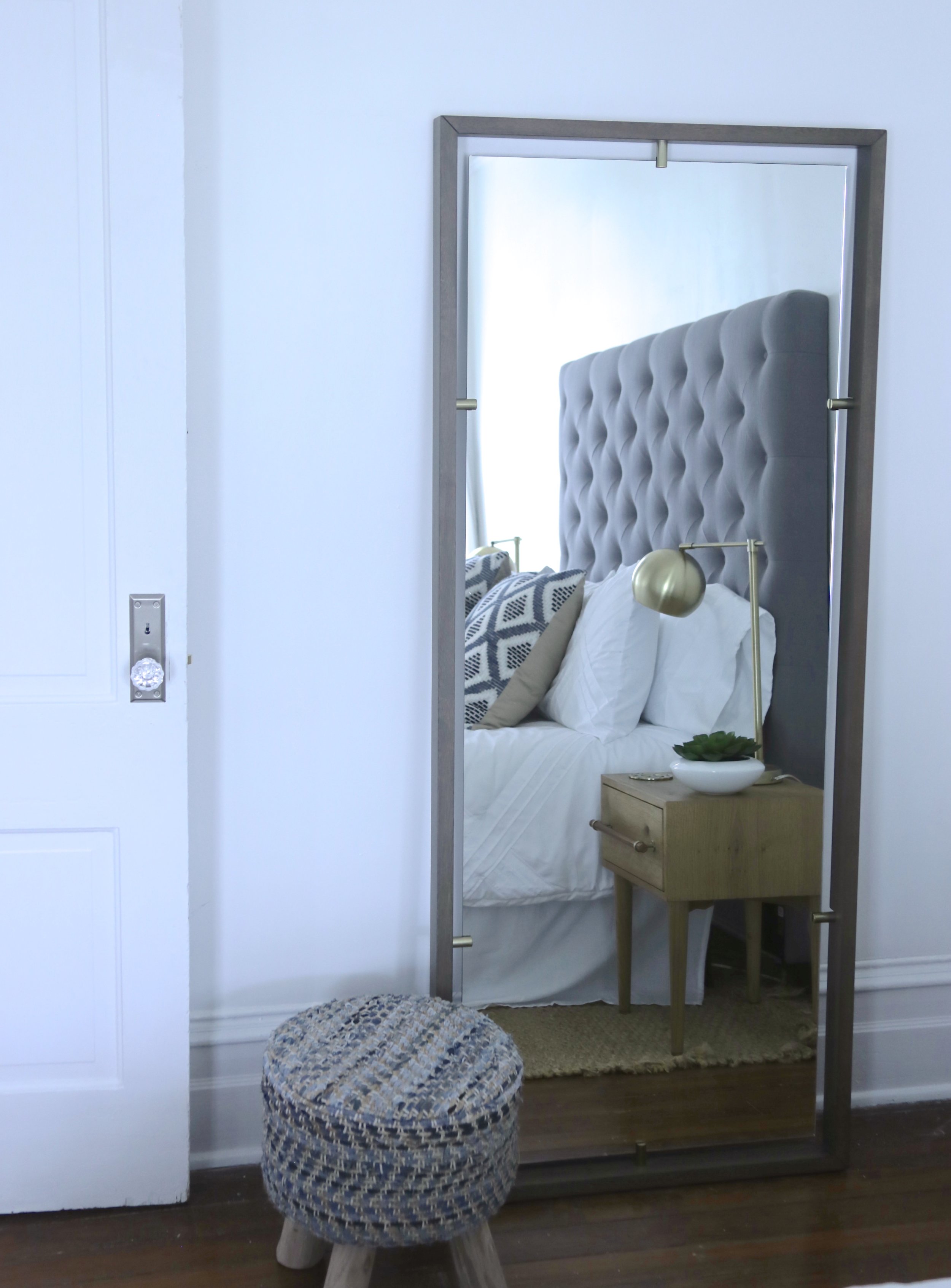
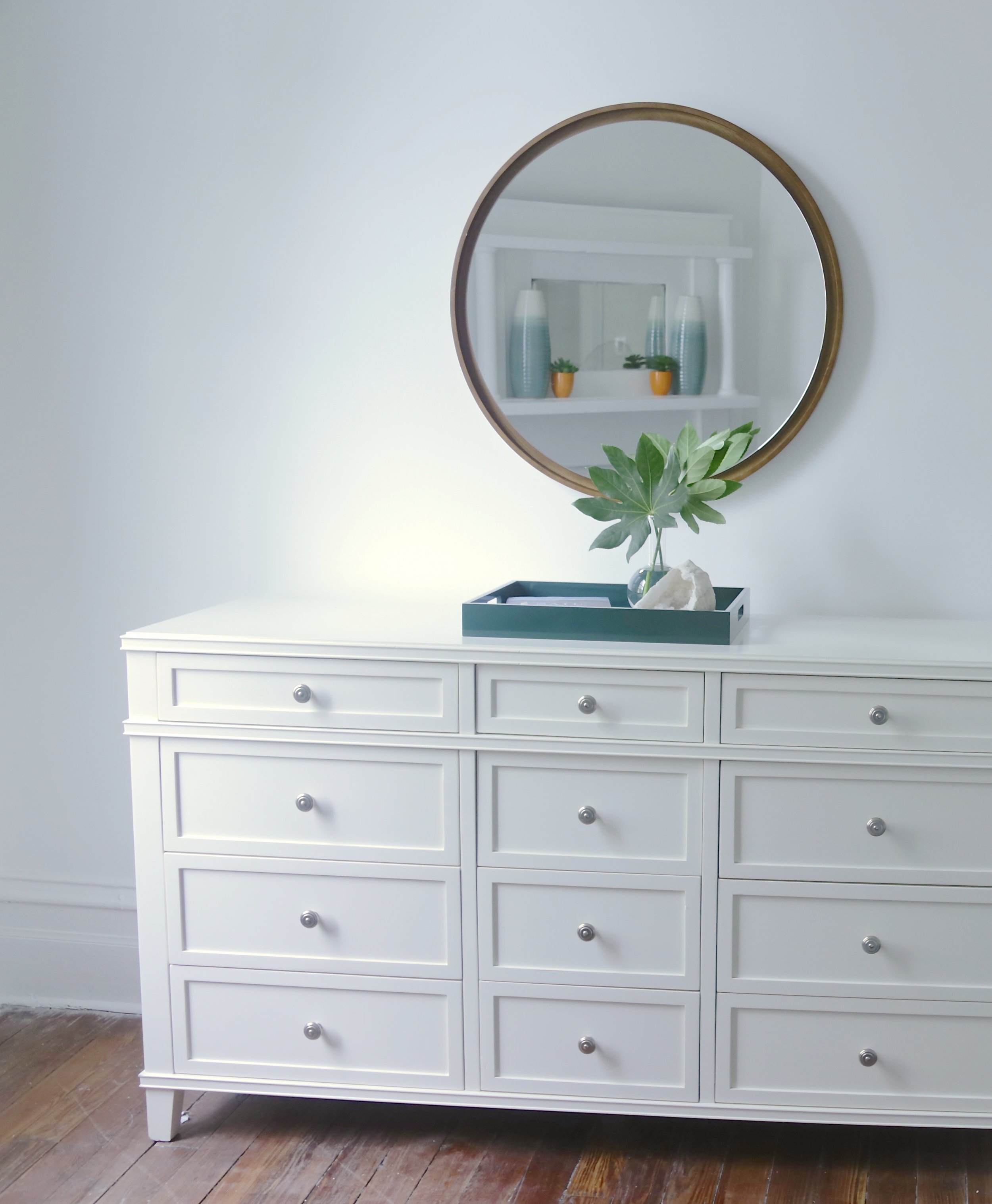
If you also remember from the "before" pictures, on the back wall there was a very large built-in shelving unit and one of the doorway frames I was talking about earlier in the backstory portion of the post. Both of those areas were removed and drywalled over to give us a nice, clean wall for the large headboard. A large jute rug added much needed texture and warmth and defined the space to really set the bed off as the focal point of the room. The mid-century lowboy dresser provided ample space for guests to put away belongings and the dark wood was a nice contrast to the other furnishings in the space.
We continued with the casual, romantic feel of the drawn back curtains from the living room but used blackout panels in all of the bedrooms to give guests more privacy. A navy blue arm chair provided a welcome spot for reading or putting on your shoes in the morning before heading out for a day of adventure.
THE BATHROOM
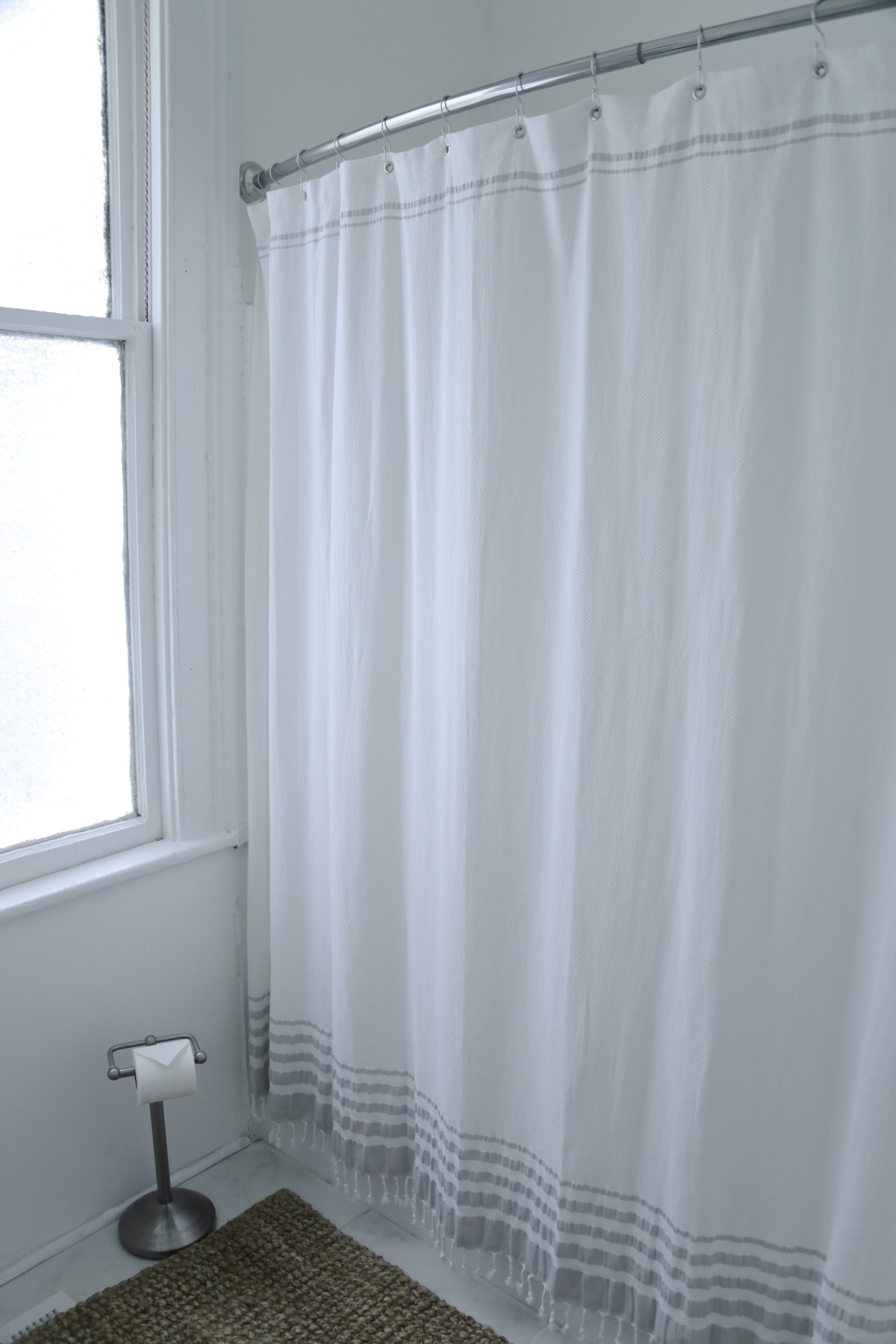
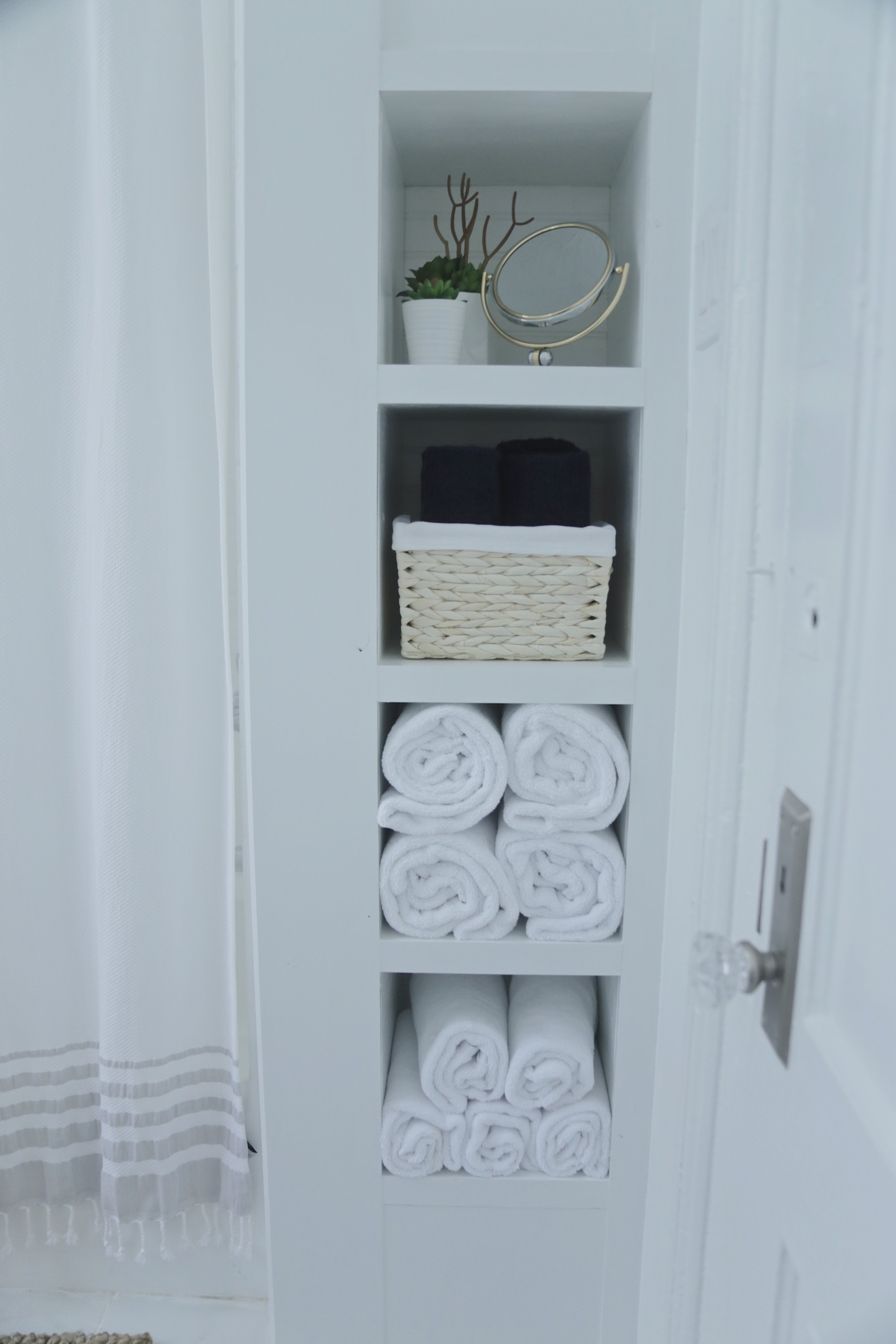
The downstairs only had one bathroom, and unfortunately, it was not a large one. We didn't really have the option of expanding the bathroom due to the layout of the house, so we had to be smart about maximizing the space as is. If you remember from the "before" pictures, the bathroom had these insanely textured walls that needed to go. We were able to smooth out some areas, but most of the bathroom had to be re-drywalled. A new vanity and some custom cubbies provided much needed extra storage. We also had a very simple wire bin that housed rolled up bath towels for guests. A textured jute rug and fringed shower curtain added a slight boho touch to the room.
THE HALLWAY
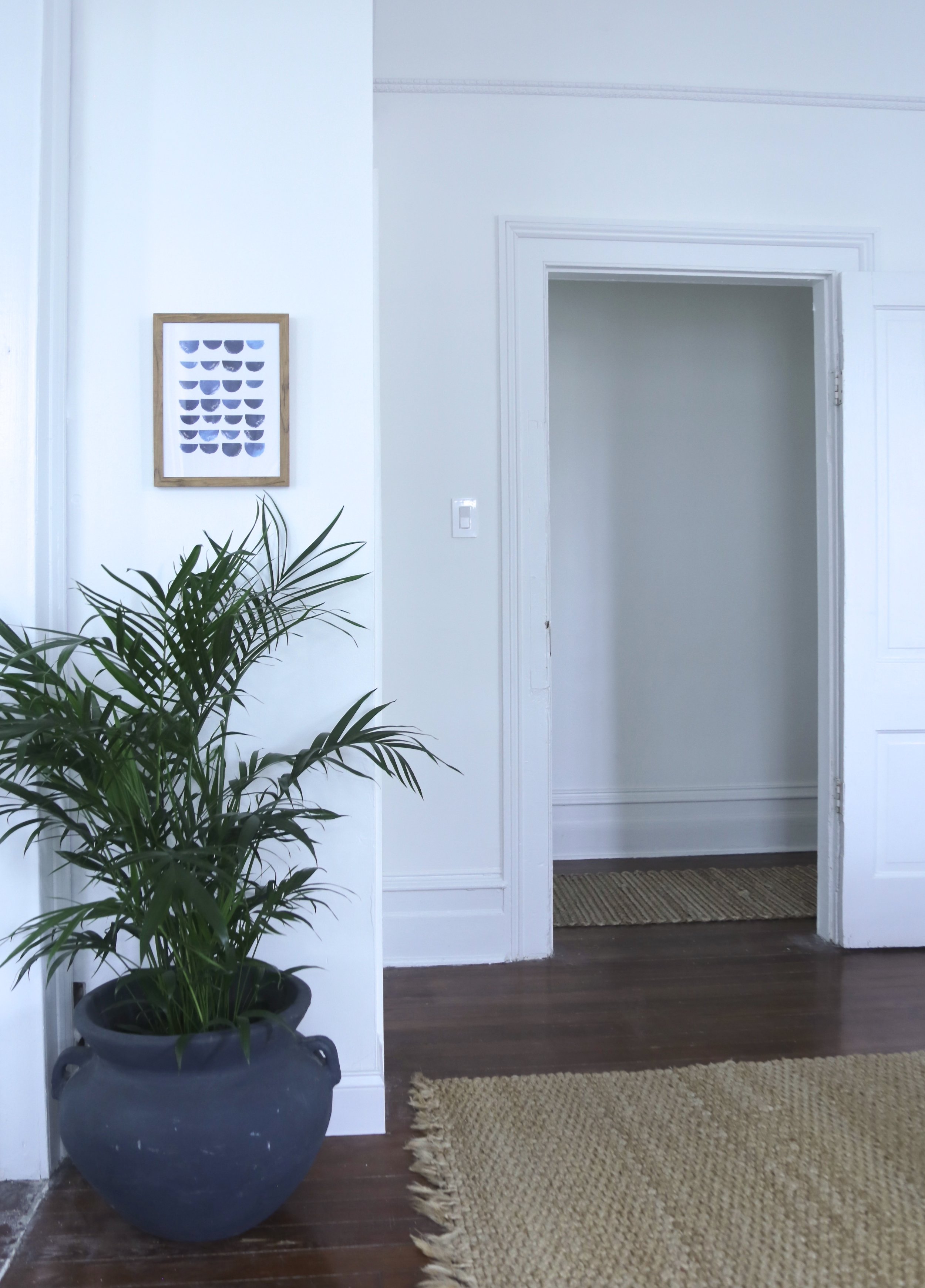
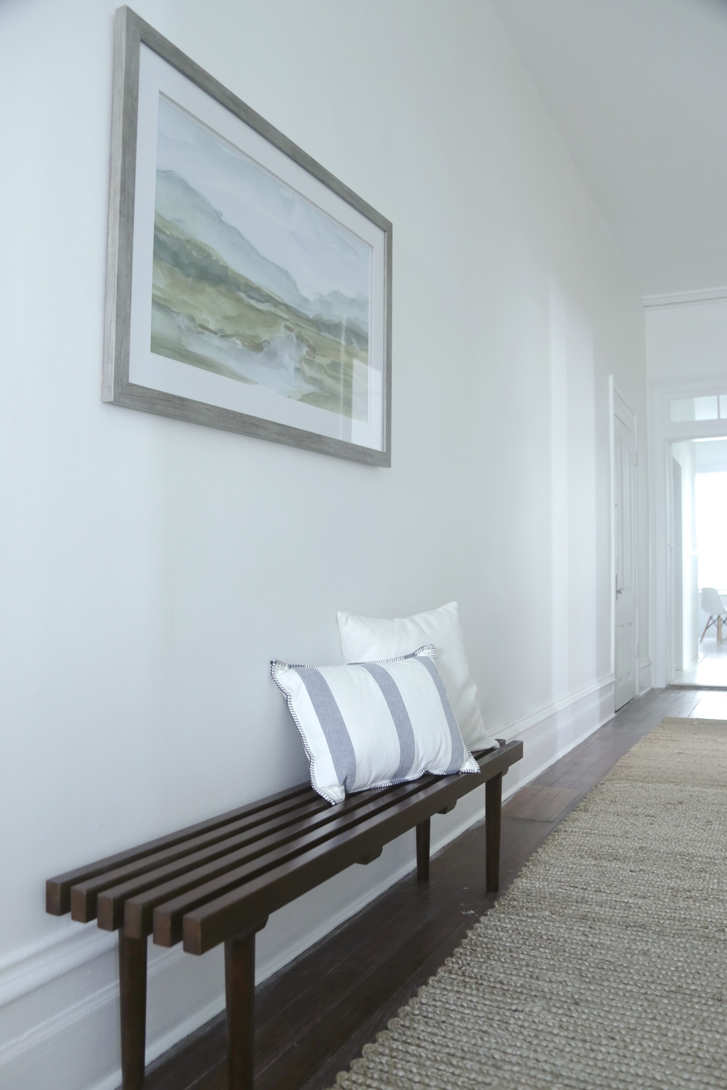
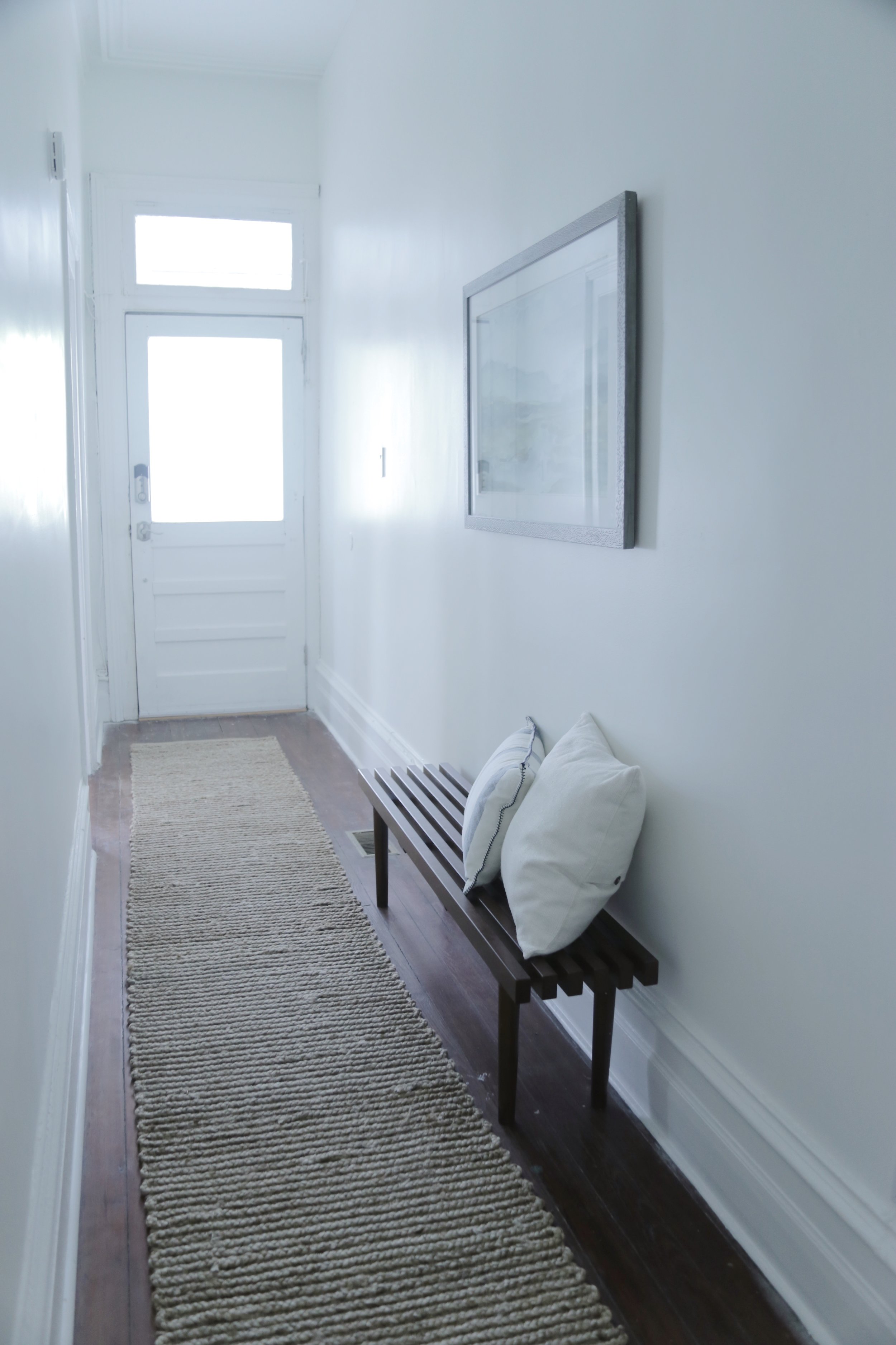
We kept the long hallway leading from the front door to the back of the house very simple and understated. A dark, wood slat bench with some throw pillows and a large landscape painting defined the entry and provided a quick spot to drop bags and shoes. A long jute rug added texture and led your eye towards the back of the house to the kitchen.
THE EAT-IN KITCHEN
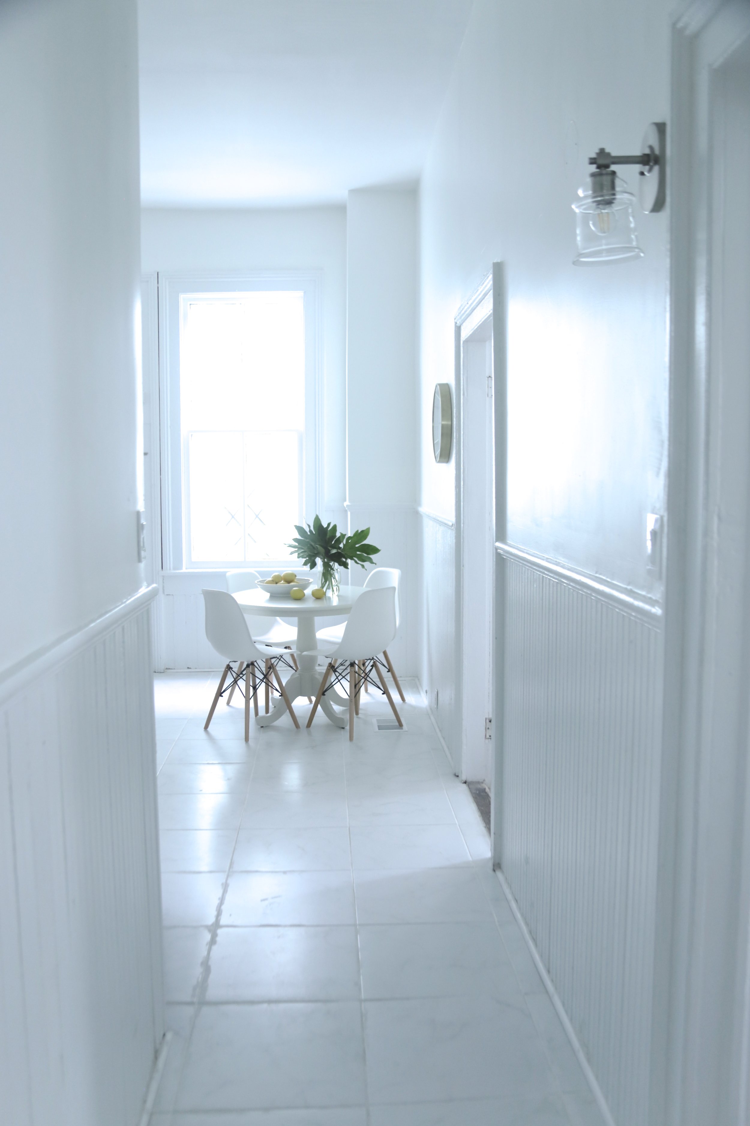
The kitchen definitely needed to be updated, but there wasn't room in the budget to completely gut and start over, so we had to get creative. We decided to redo the tile floor (which also connected with the bathroom), and that change made a big visual impact to the space. I'm so glad the owners decided to make that investment. Getting rid of the old beige tile and replacing it with a bright, faux-marble, porcelain tile quickly gave the space a fresh new look.
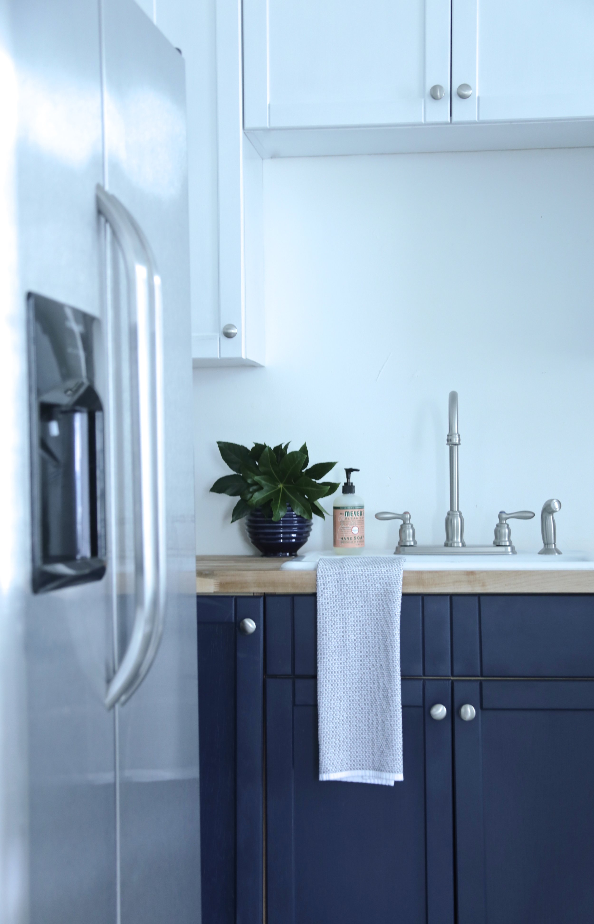
Since we had to work with the existing cabinetry, we decided to paint them to give them a little "oomph." I chose Valspar's Oceanic for the lower cabinets and Behr's Ultra Pure White for the uppers. New butcher-block countertops, sink, and appliances completed the update.
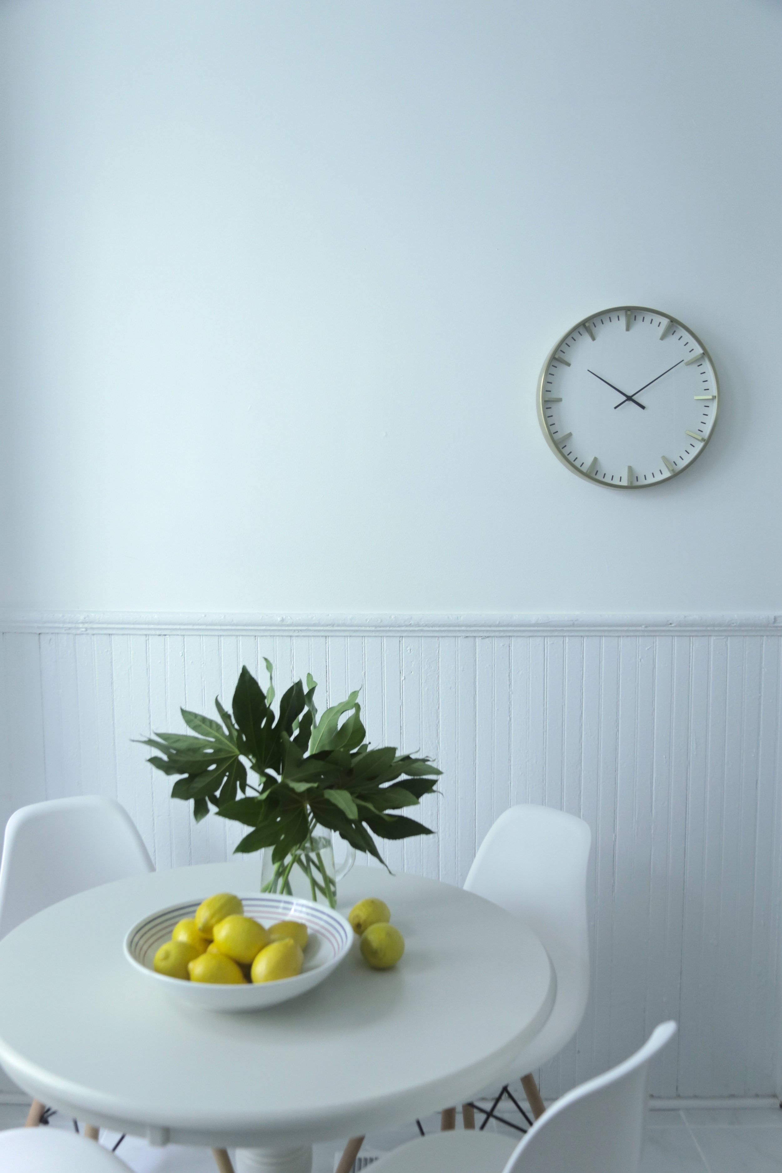
There was not enough room for a formal dining space on the lower level, but the open space next to the kitchen window was the perfect nook for a small round dining table and chairs. I just love how bright, airy, and modern that little nook turned out!
THE SECOND BEDROOM
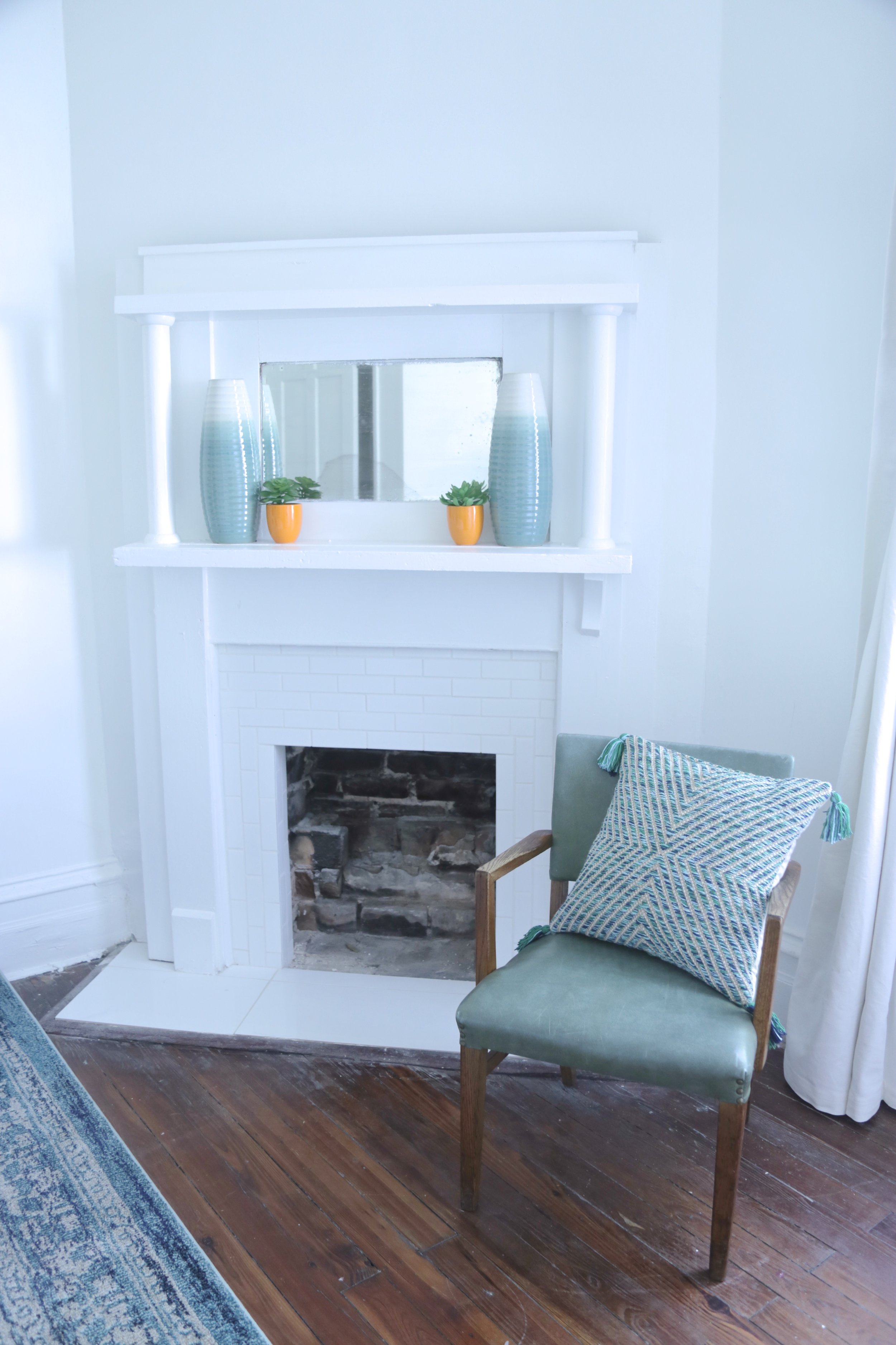
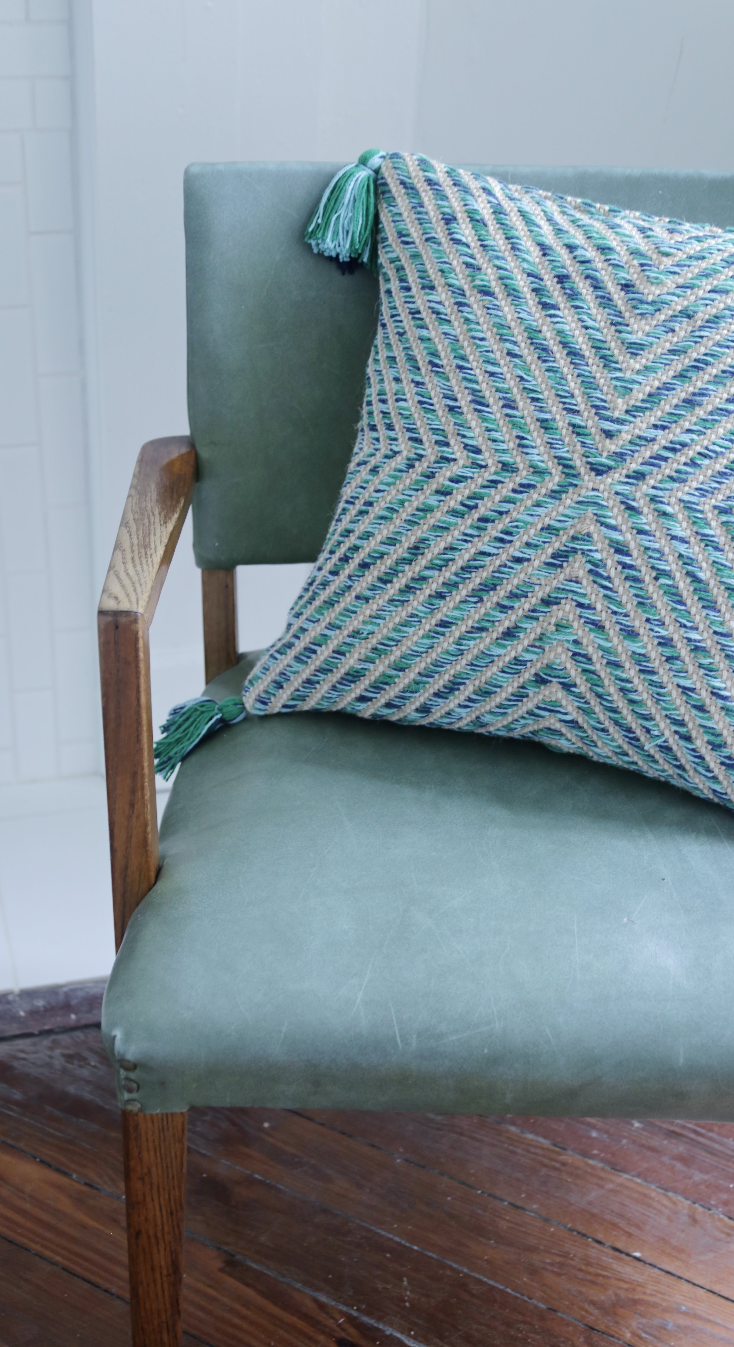
The second bedroom continued with the cool color palette of the house but had a slightly more teal color story than the master bedroom. The fireplace had been bricked in, but we restored it and opened it back up again. This room has a slightly more California-cool vibe than the rest of the house with the mid-century inspired headboard, chair and playful, watercolor artwork. The over-dyed rug, pillows, and striped throw bring in texture and pattern while the crystal lamps keep the decor sophisticated and slightly more "dressed-up."
THE THIRD BEDROOM
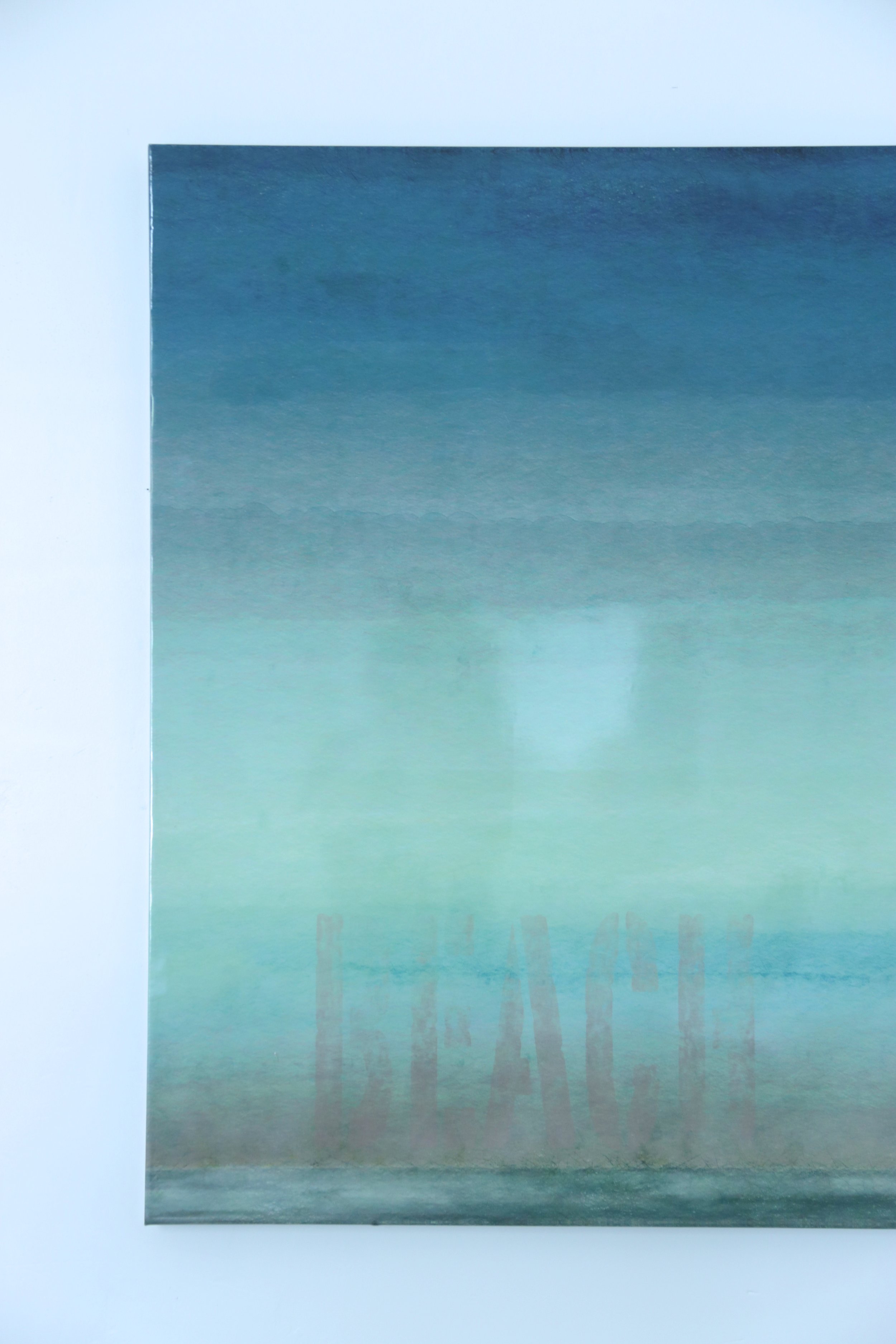
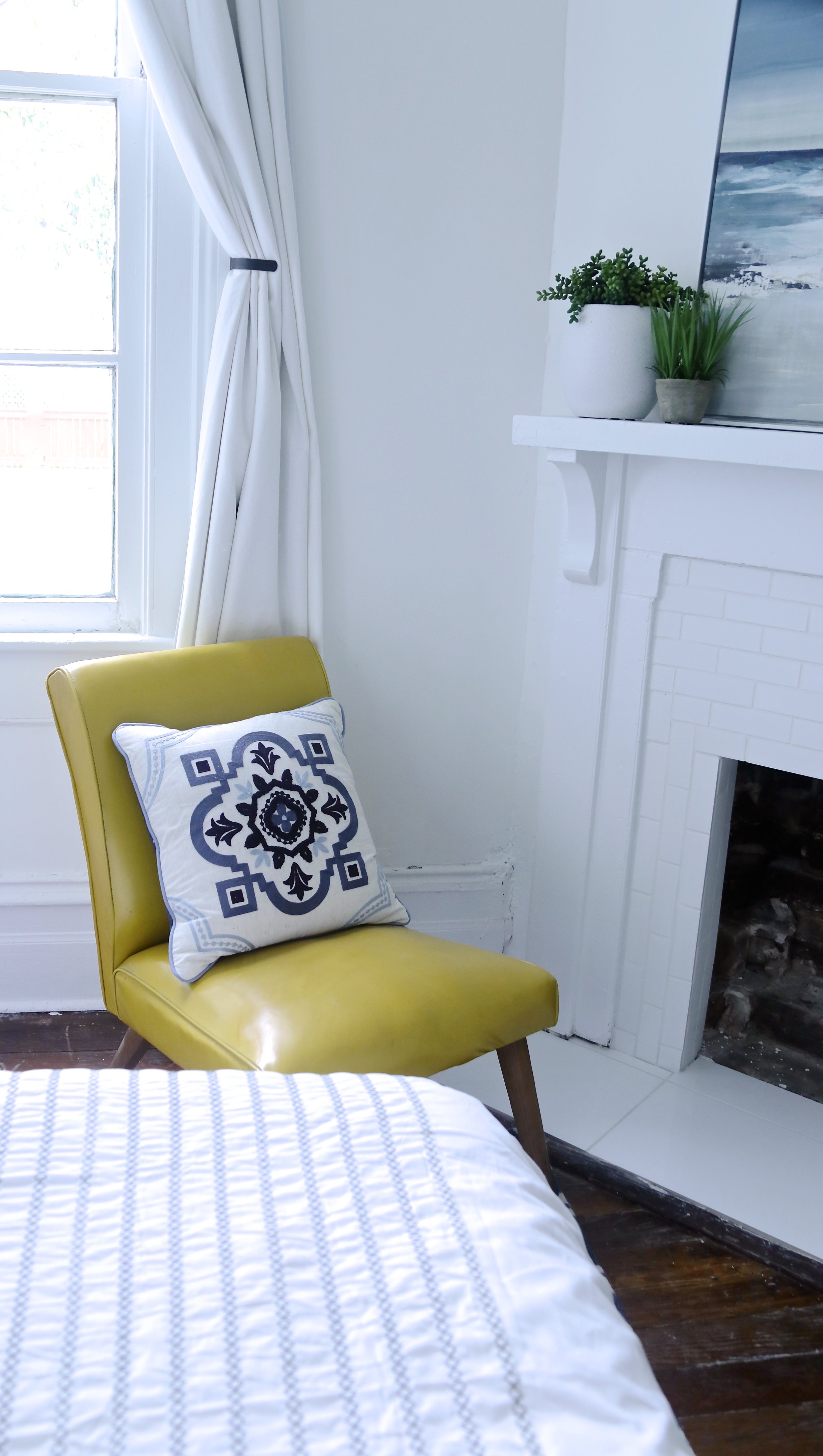
The third and final bedroom was the smallest of the three but had beautiful light that poured in from the three large windows. The nightstands and dresser were a set the owners already had and wanted to include in the house, so we chose a more traditional style headboard in an off-white to compliment their style. For this room, I introduced a modern quatrefoil/medallion motif on the rug and accent pillow. The textured, stripe pillows on the bed mimicked the contrast stitching on the duvet cover. And I just LOVE that pop of yellow with the mid-century chair! (Truth be told, yellow is my favorite color, and I love when I can introduce it into spaces I am decorating.) The oversized ocean painting casually leaned on the fireplace mantle with potted plants was a nod to the coastal vibes going on in the rest of the house.
Whew! High fives if you made it this far! I hope you enjoyed reading about the transformation of this amazing home! If you are planning on making a trip to Savannah and are looking for a place to stay, I (obviously) highly recommend this charming AirBnB for your stay! Be sure to check out pricing and availability here. Thanks again for reading along!
